Since the light spectrum is intrinsic to ZEISS, we focus on light and shadow – black and white, with a targeted use of color.
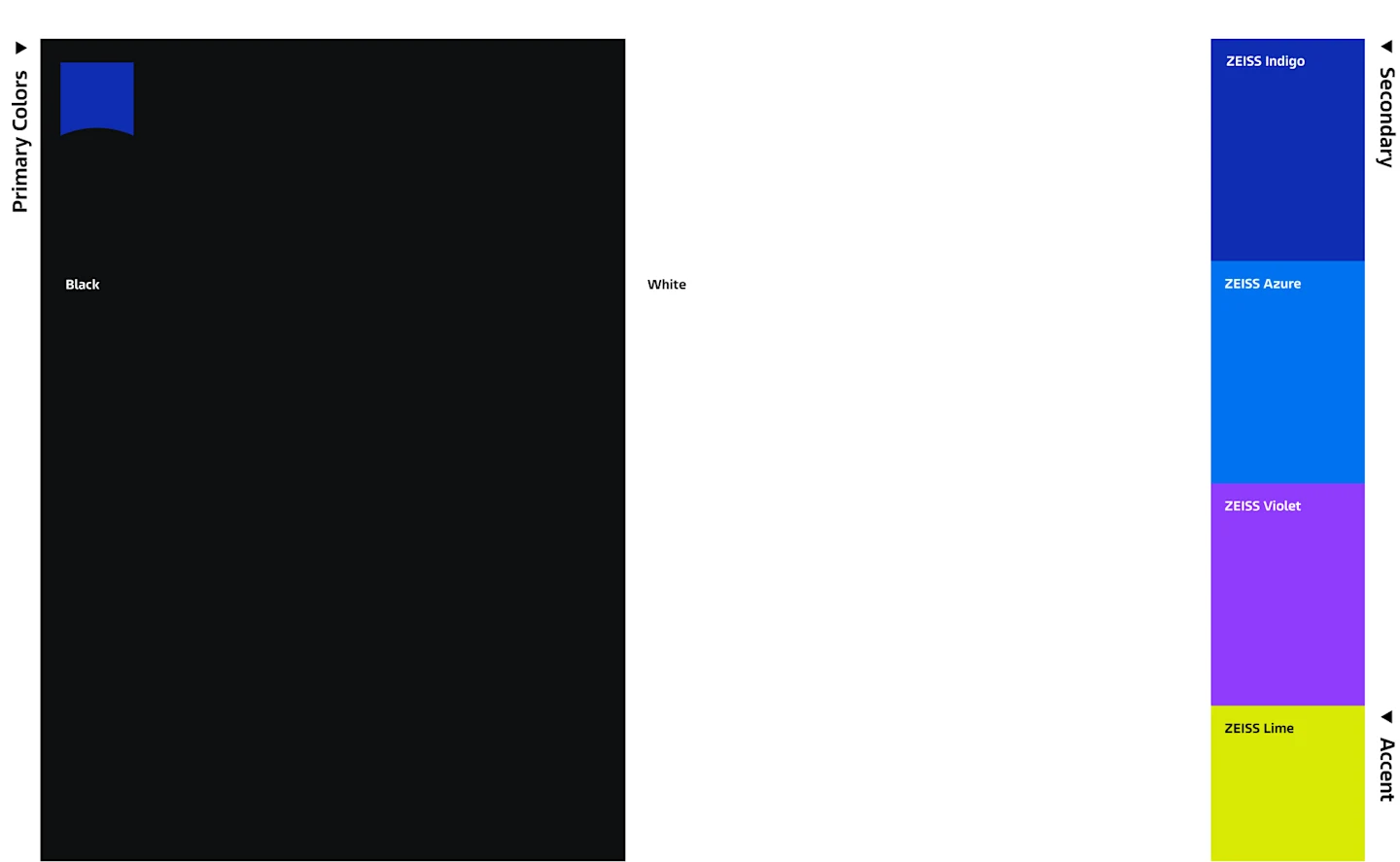
Black, white, and the ZEISS Logo in ZEISS Indigo deliver the first impression of the ZEISS Brand.
Secondary colors provide visual emphasis.
The accent color, ZEISS Lime, creates targeted highlights.
Contextual colors provide additional color sets for specific applications.
at a
glance
The application examples prioritize black and white. Additional colors are only used for a clearly defined purpose.

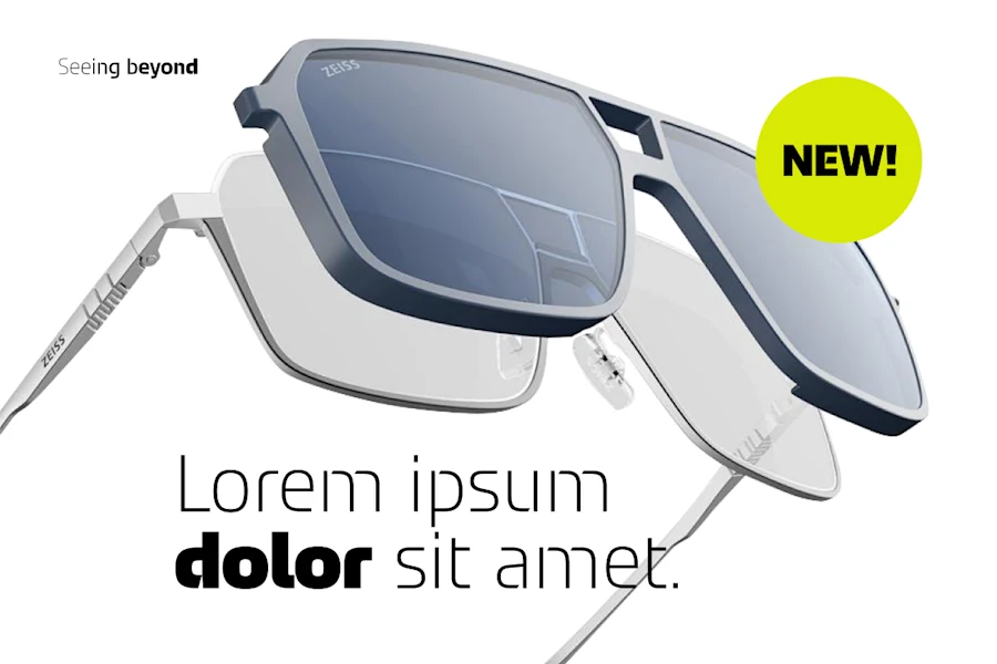
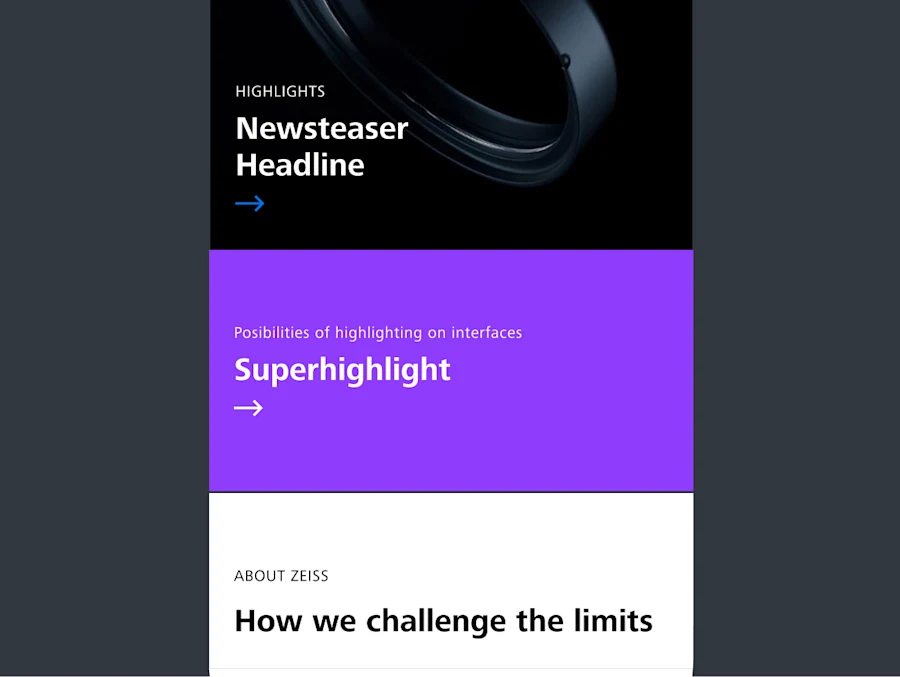


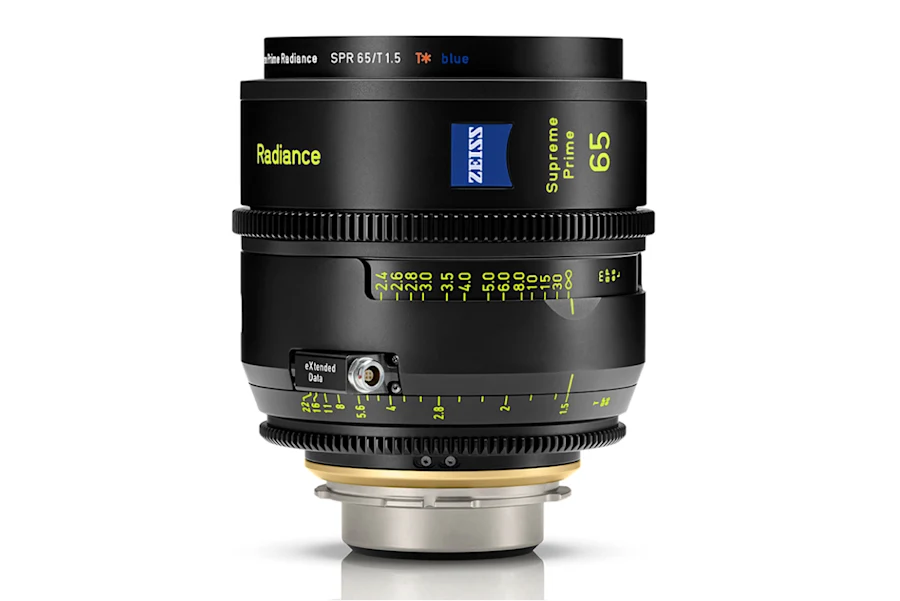

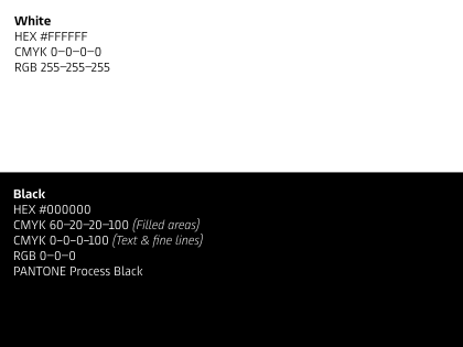
The main colors of the ZEISS Brand are white and black.
There are two different CMYK options for black: a four-color version for filled areas and a one-color version for text and fine lines.
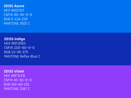
The secondary colors are ZEISS Indigo, ZEISS Azure, and ZEISS Violet. All secondary colors can be used flexibly.
However, there is one exception: Only ZEISS Azure is used for interactive elements.
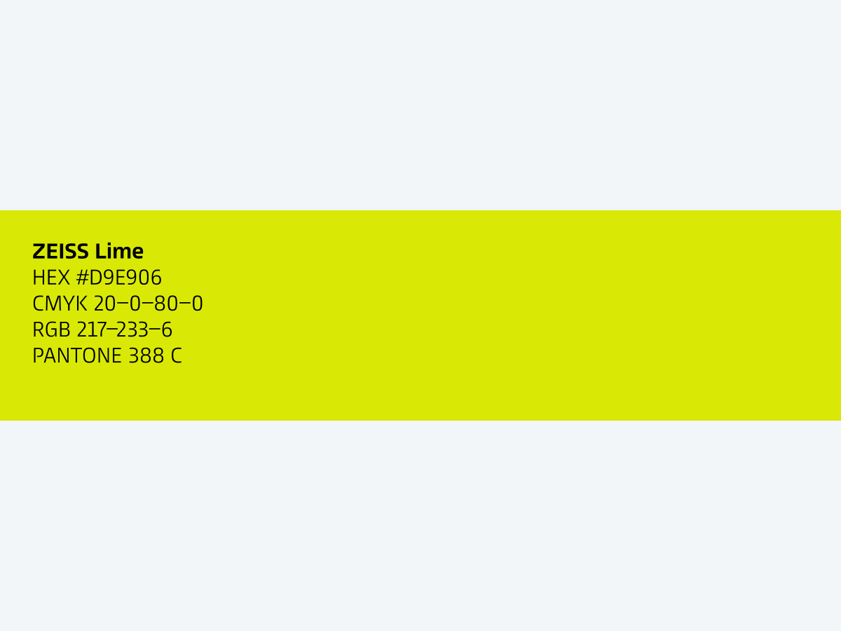
The accent color, ZEISS Lime, is used for highlights.

Contextual colors are intended for very specific purposes in different applications, such as for illustrations, UI, ISO standards, or signals.


First, white space is still valid. It will also be possible to use both white space and black space. Since the light spectrum is intrinsic to ZEISS, we focus on white and black space, with a targeted and differentiated use of color.
You can use the secondary color ZEISS Violet as needed. Secondary colors provide visual emphasis on a black or white stage. Please note that, in digital media, only ZEISS Azure is used for interactive elements and must not be changed. Likewise, ZEISS Indigo is the only color used for our logo.
The new ZEISS Violet looks different in CMYK than in RGB because certain vibrant screen colors cannot be reproduced exactly in print. For CMYK, we use an adjusted version of ZEISS Violet that intentionally deviates from the on-screen tone but delivers a more balanced color image, clearer differentiation from the other brand colors, strong contrast with black and white, and more reliable handling in print alongside the other colors, especially ZEISS Indigo.
The communication surrounding the Agenda 2030 should stand on its own. Therefore, it was decided to use separate colors for the communication of the Agenda 2030 that harmoniously fit with the upcoming ZEISS Brand Design, but do not appear in the primary or secondary colors of the new design system.
Shades of secondary colors are not permitted.
Exceptions are made only in special cases or for functional reasons, for example accessibility or contrast in digital channels. Please check requirements in the Beyond Design System where relevant.
Yes, that is correct. Swatches refers to tints or shades.
Correct. Secondary colors should not be used in lighter tints.
You can find the relevant information in the contextual colors section on the colors page on the Brand Portal.
A new Word template, which has been aligned with the PowerPoint template, is already available. You can find it under New in the ZEISS folder. When you open the template, the ZEISS colors are included.
The Excel template will be available soon.
It depends on the purpose. Red can be used for warnings and notifications.
The Internal Channels team is already in contact with the provider regarding the colors for teamZEISS.
This information will be updated on beyond.zeiss.com.
Corporate Brand, Communications & Public Affairs