To ensure a consistent look in your videos, please use the templates provided and get inspired by the application examples.
Three lengths are available for the respective use cases.
The logo ending is available in a light and dark version and three different screen formats.
Regular version (3 seconds)
Cinematic version (5 seconds)
A short opener is available for instances where the connection to ZEISS may not be obvious. For example, when videos from different brands appear in a sequence or a loop.
The opener is available in a light and a dark version and three different screen formats.
The lower thirds file is available in a light and a dark version and three different screen formats.
Do not overuse these effects!
The effects work best with footage where the camera is panning forward or moving into the picture.
An abstract tunnel consisting of several frames interweaves two scenes and creates a dynamic transition.
This should only be used when it has been planned and implemented conceptually. It represents a huge leap in terms of content, location, or thought.
The hyper zoom is available in three different screen formats.
This stylistic tool emphasizes Seeing beyond and creates a more subtle effect using solids.
The flat zoom should only be used when it has been planned and implemented conceptually.
The flat zoom is available in three different screen formats.
This is a subtle, simple-to-use transition that is on brand.
The single layer transition is available in three different screen formats.
The typography guidelines also apply to motion graphics.
The typographic solution is available in three different screen formats.
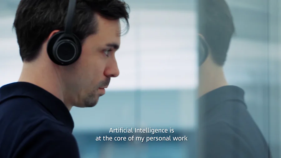
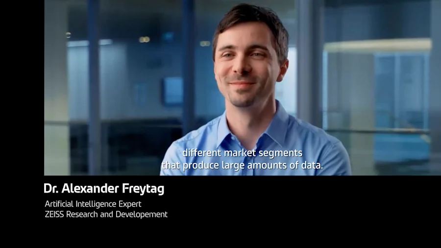
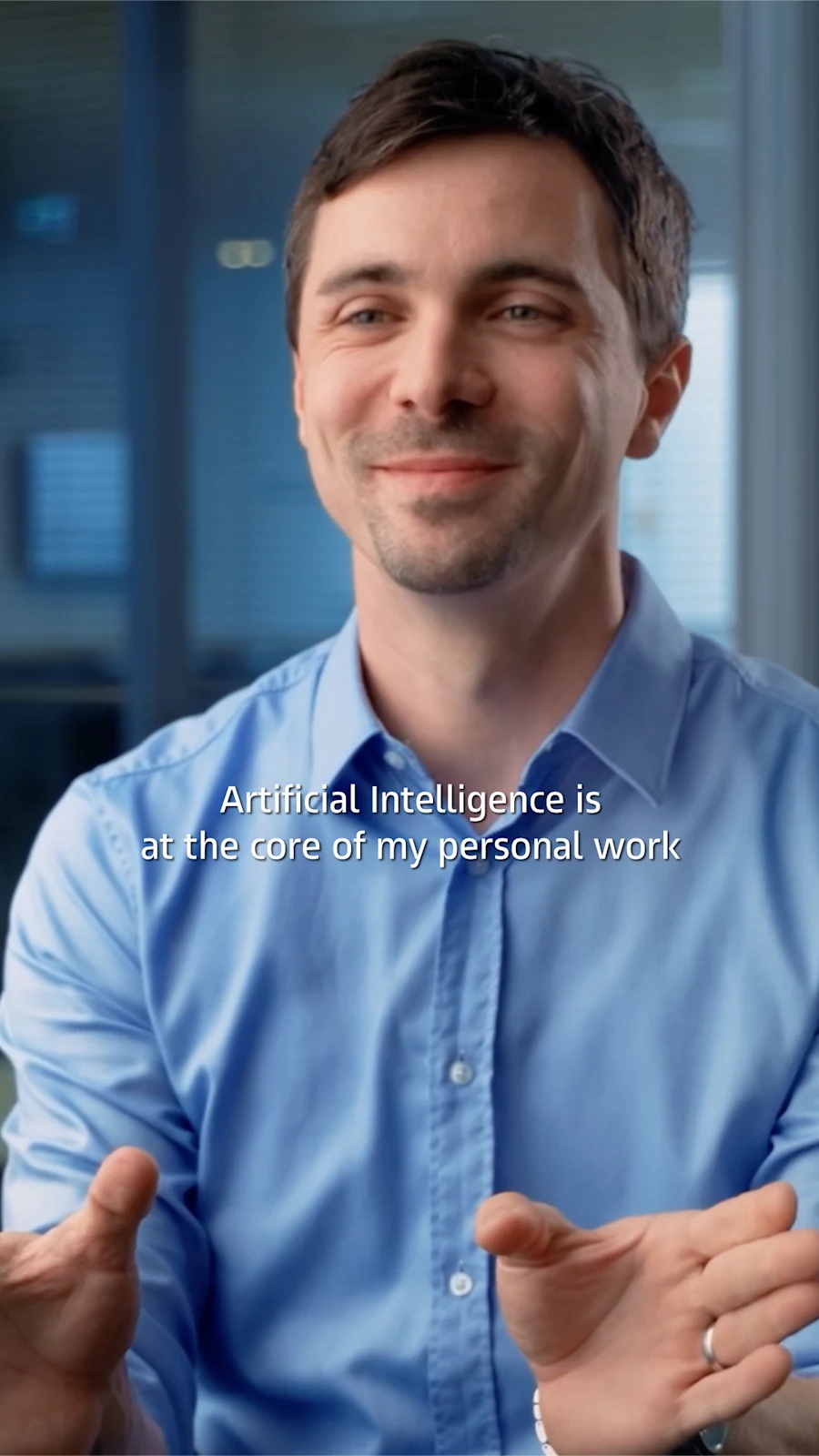
To achieve maximum accessibility, we create subtitles to reach people with hearing impairments and people who speak other languages.
If possible, flexible digital subtitles that are superimposed on the video by the player, such as YouTube, are preferred.
In order to reach as large an audience as possible, we recommend translating subtitles into the relevant market languages.
If, for technical reasons, subtitles must be permanently burned into the video, an Adobe Premiere template is available.
When using a lower-thirds banner, the subtitles are moved up to ensure readability.
For more elaborate storytelling and to emphasize certain information, the variable motion font can be used to animate the text. We recommend using this with care to avoid wearing out the effect too quickly.
Note: To achieve smooth animation, please use the optimized version for motion design of the variable font.
To create even more depth, text can be placed behind objects.
This applies primarily to composite graphics, where objects can be placed and animated specifically in the layout.
Build up color solids or additional elements according to the central perspective.
If legal information/credits are required, please observe the specific rules for your strategic business unit.
Corporate Brand, Communications & Public Affairs