Every day, our customers and partners encounter the ZEISS Brand via digital products, services, and communication channels. Few brand experiences are more influential because these happen in such close proximity to people’s everyday lives. That’s why maintaining a consistent digital appearance is vital to reinforce our brand equity – how people feel and what people believe about ZEISS.
The Beyond Design System helps you deliver outstanding digital experiences.
The Beyond Design System offers comprehensive design guidelines and tools for bringing the ZEISS Brand to life across different digital media. This enables you to create consistent, high-quality experiences that are user-focused while also saving time and resources.
The Beyond Design System standards are mandatory for all new software projects and recommended for legacy projects to ensure uniformity and connectivity.
The Beyond Design System is constantly evolving to meet the changing needs of users and the digital landscape. Stay up to date by using this living system.
Beyond for Online Experiences provides comprehensive guidelines and assets for designing and developing web and online experiences across all ZEISS digital touchpoints. This includes color systems, typography, icons, a component library for designers in Figma, and ready-to-use code libraries in React and Angular.
Beyond for Product Experiences provides comprehensive guidelines and assets for designing and developing digital product experiences. This includes color palettes, typography, icons, and UI components. Designers and developers can quickly create high-quality digital product experiences that are visually appealing and user-friendly.
Here is an overview of what else you will find in the Beyond Design System.
Standards for utilizing the ZEISS logo as part of user interfaces

Understand how color impacts the brand and visual design of user interfaces

Deepen your knowledge of our typography in the digital space
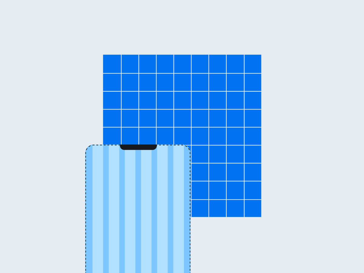
Apply layout and grids for structure, hierarchy and balance
Follow iconography rules to create a cohesive design in user interface
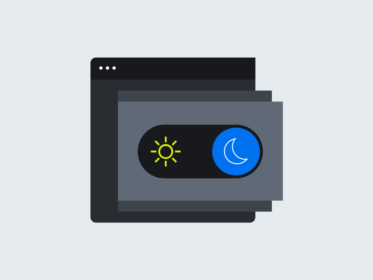
Learn how to use light and dark themes effectively
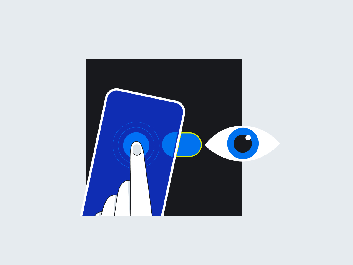
Design interactive elements to engage users
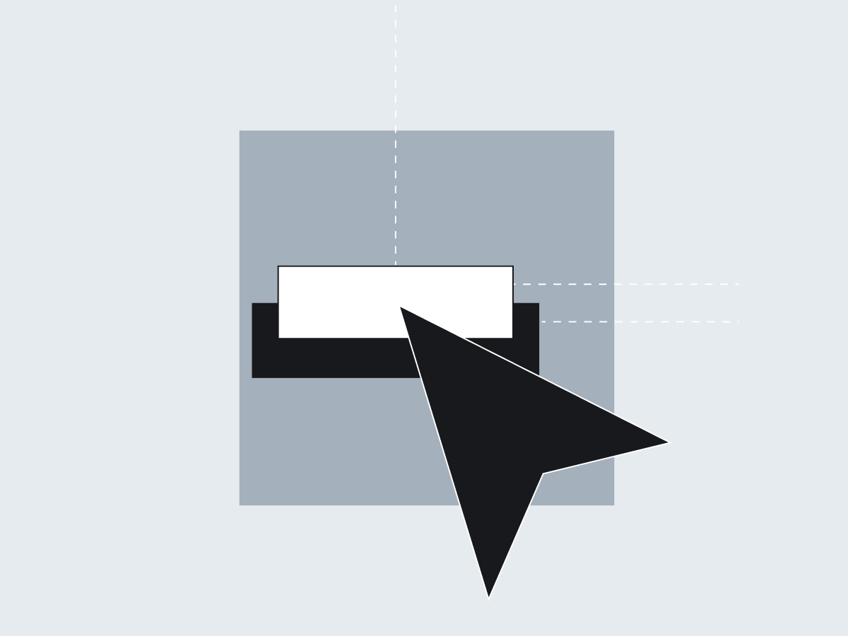
Create the illusion of depth for hierarchies in user interfaces
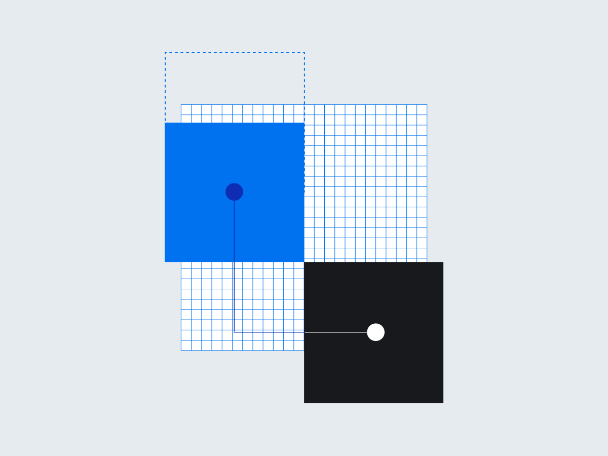
Use motion to create seamless interfaces
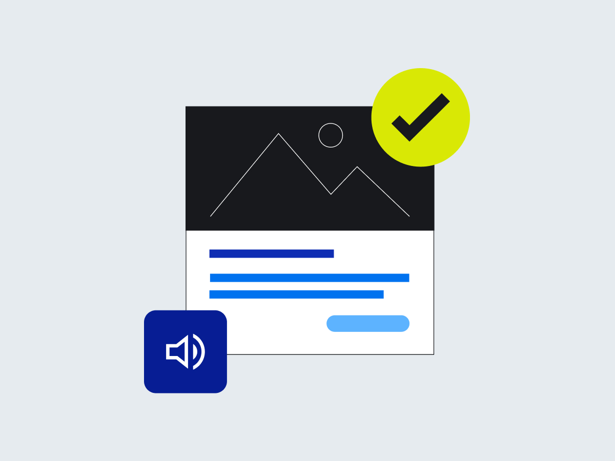
Reuse component combinations to speed up development
Ensure accessibility for all users
Corporate Brand, Communications & Public Affairs