Functional, expressive, and story icons serve different purposes, which determines their size and level of detail.
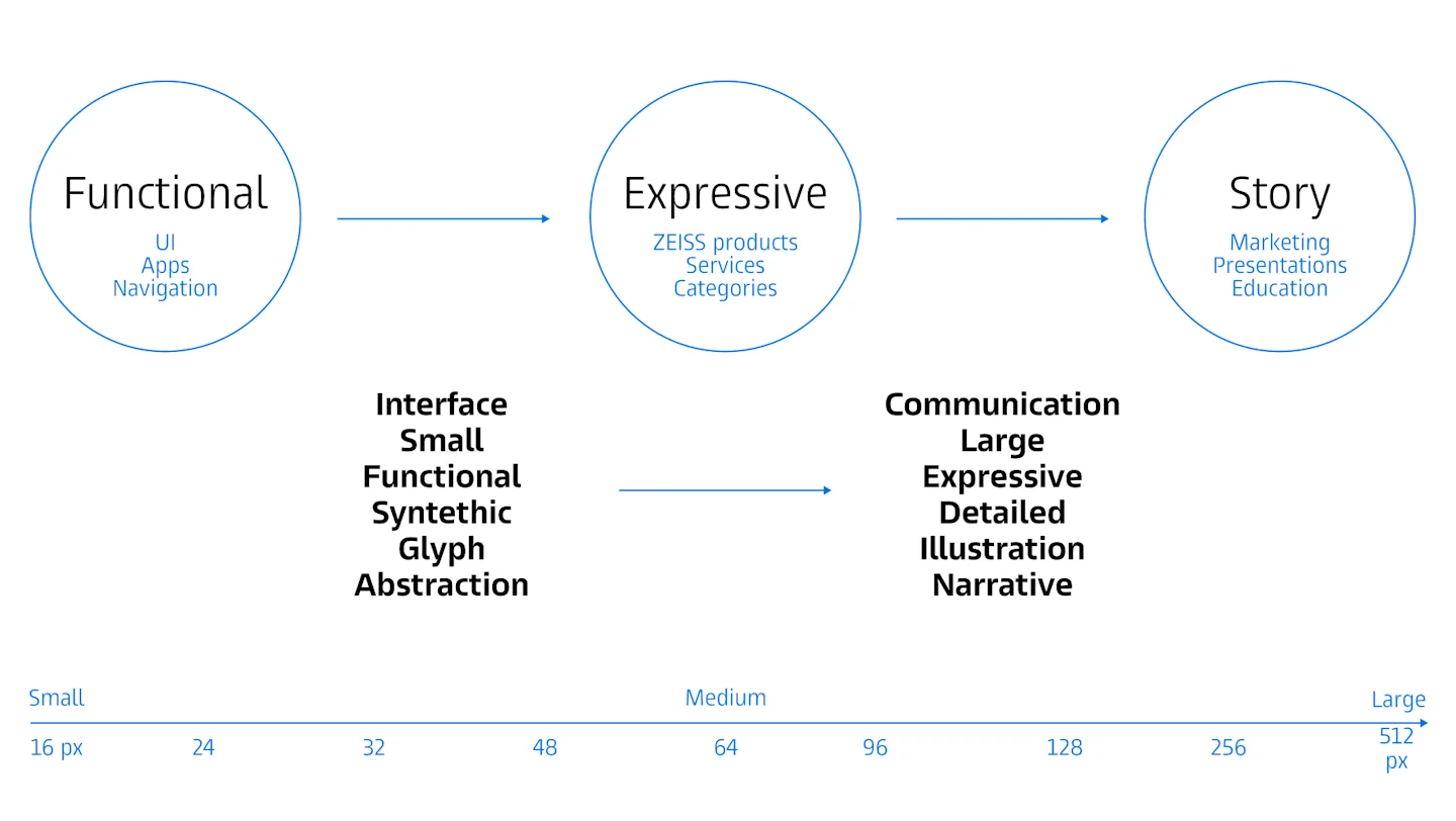
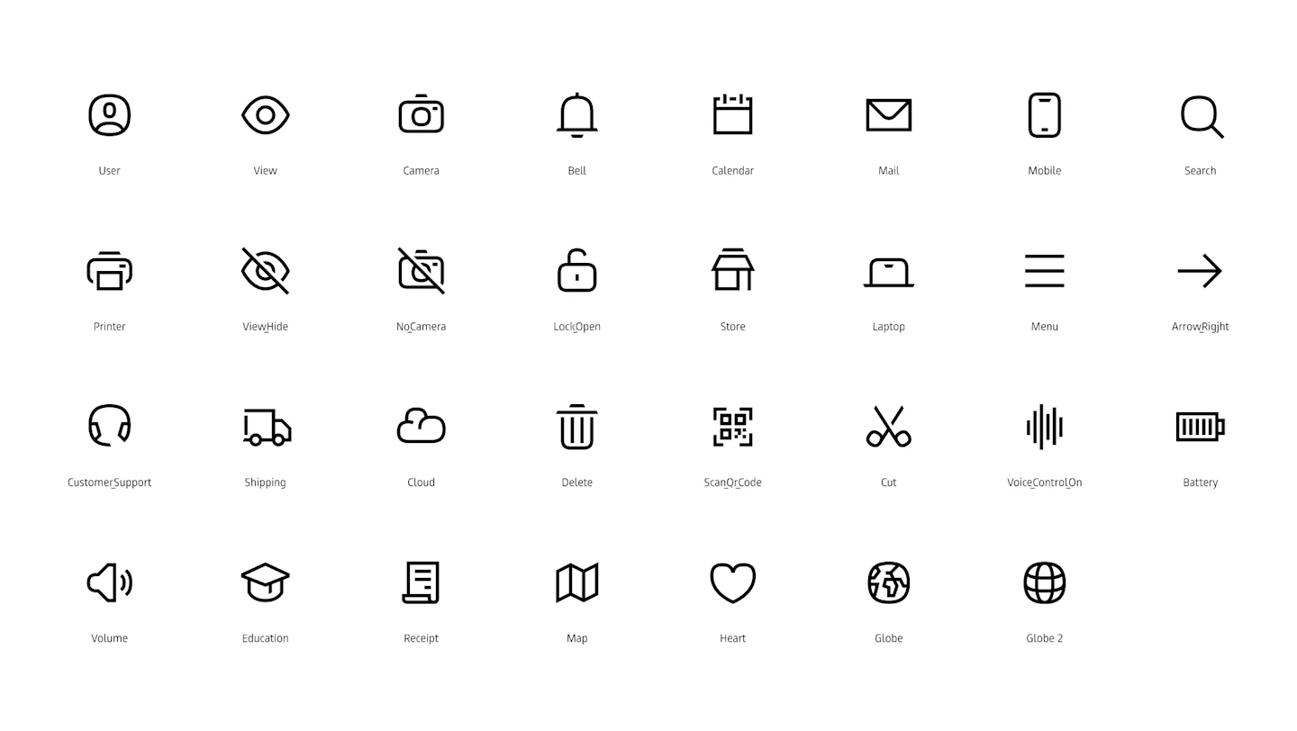
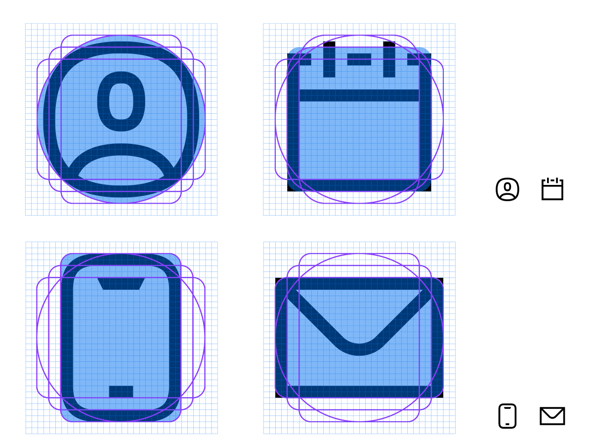
Functional icons follow the brand’s monoline, slanted, and geometric construction, ensuring clarity, scalability, and consistency across all digital interfaces.
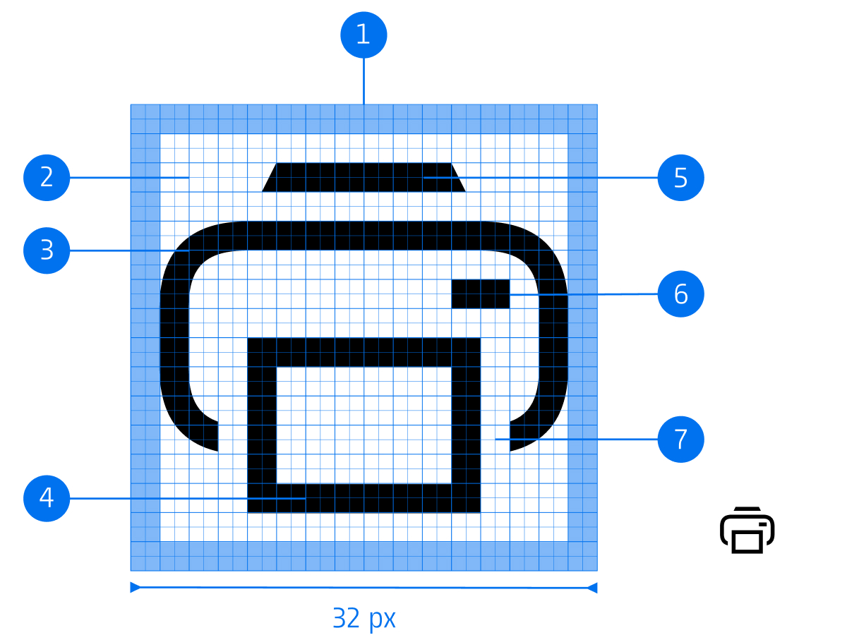
Canvas (32 x 32 px)
Live area (28 x 28 px)
Non-orthogonal curve
Thickness (2 px)
Slant
Stroke ending
Overlay (2 px)
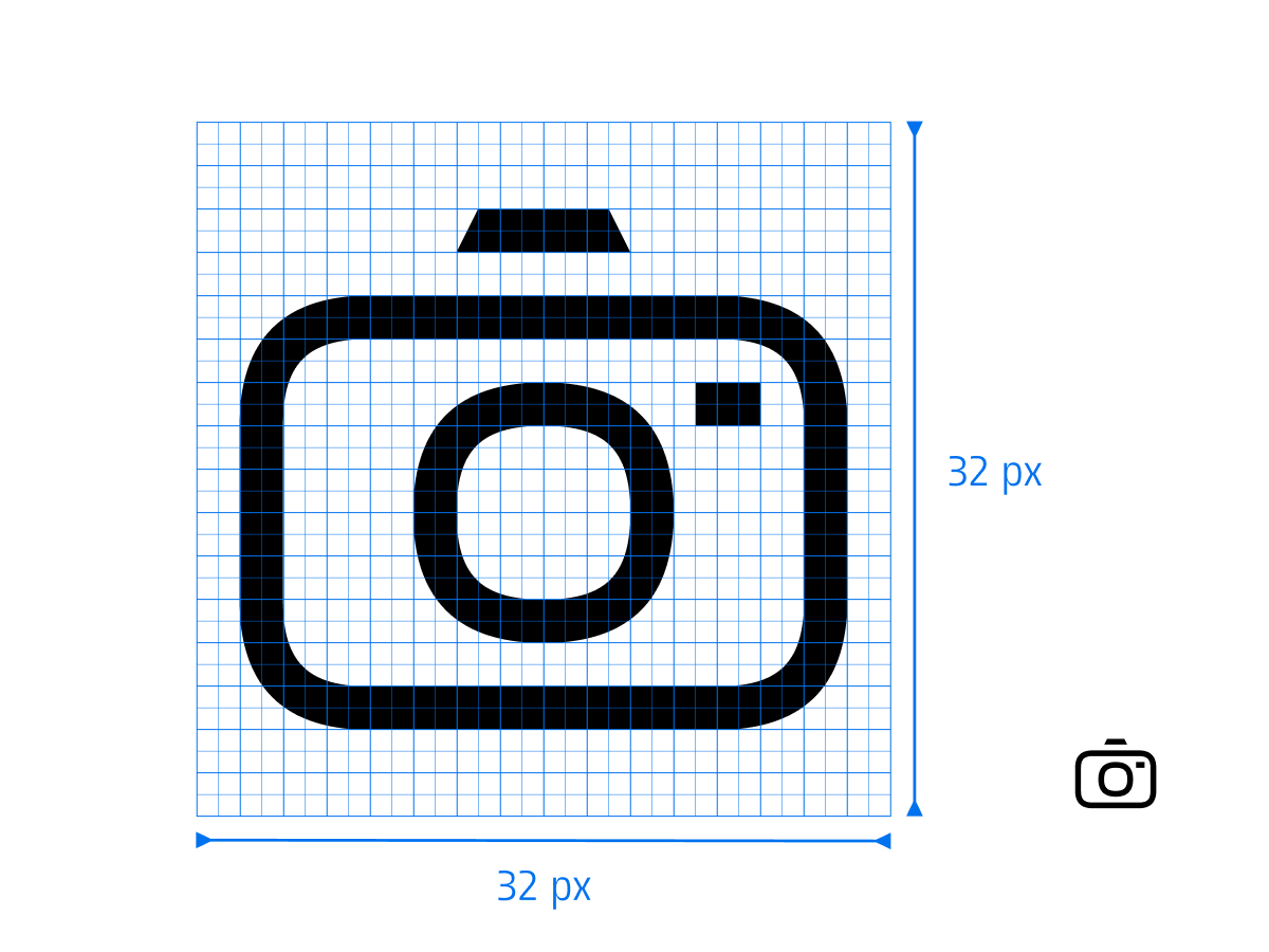
For better scalability, the grid is based on a 32 x 32 px structure with a 2 px stroke weight.
Limit icon content to the 28 x 28 px live area.
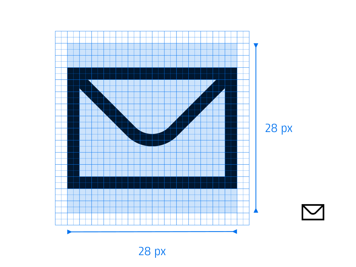
Limit icon content to the 28 x 28 px live area.
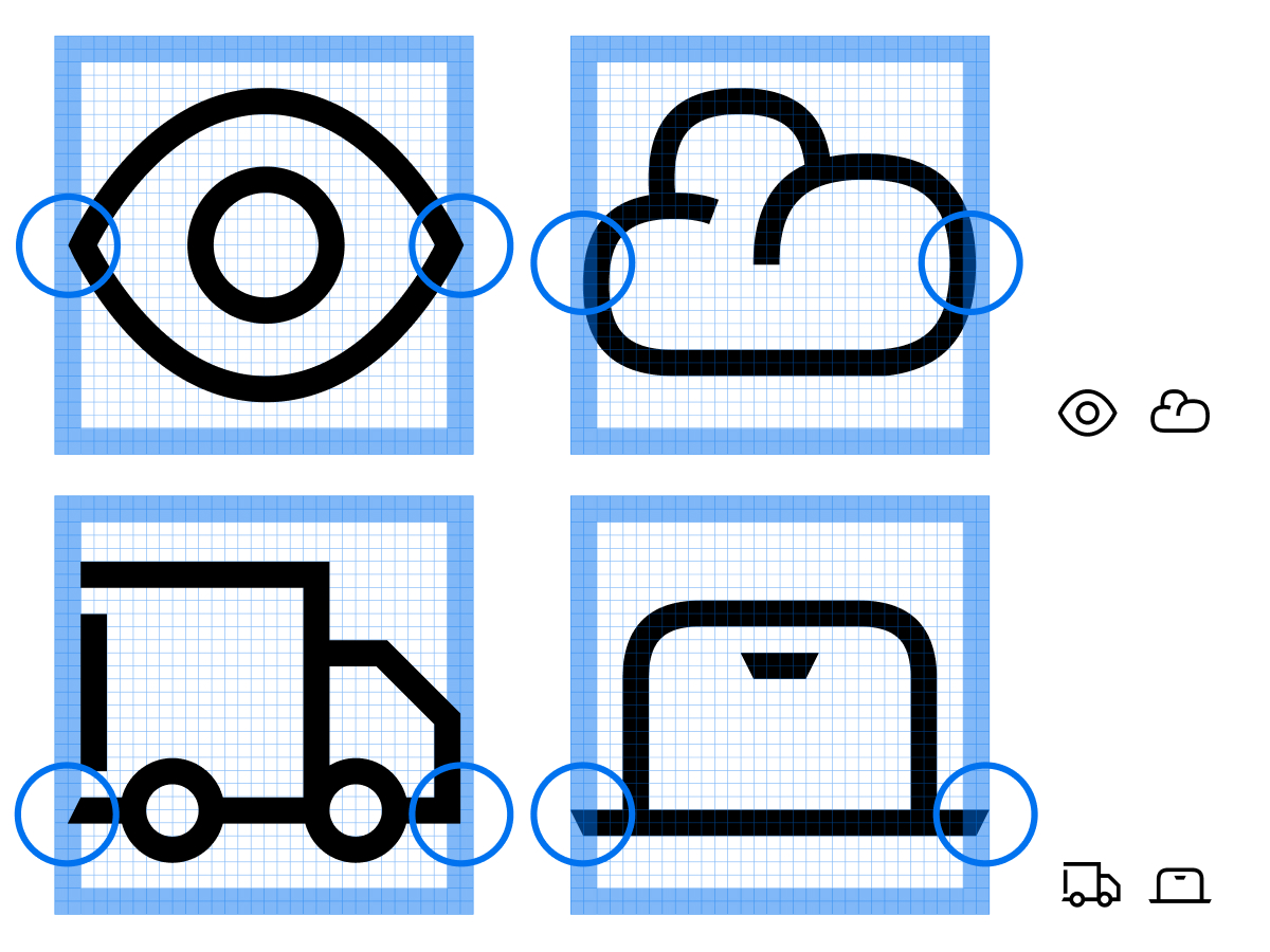
Most icons are designed to fit within the defined live area.
Additional padding may be used to accommodate wider or taller icons, ensuring consistent visual density and weight across the grid.
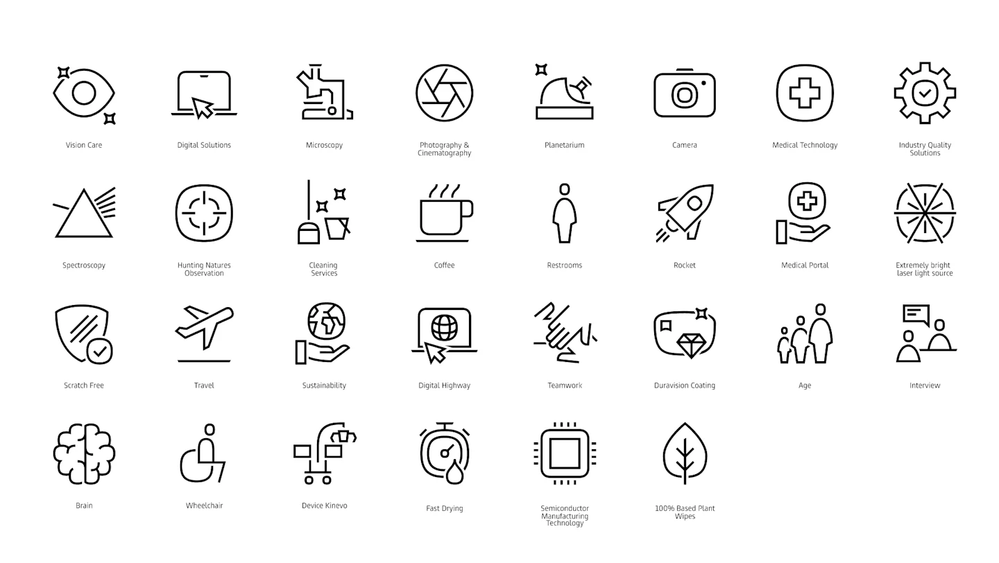
Expressive icons are designed for larger scales and allow for greater detail.
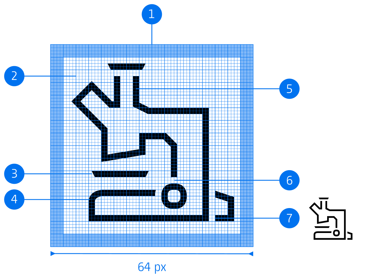
Canvas (64 x 64 px)
Live area (56 x 56 px)
Slant
Non-orthogonal curve
Thickness (2 px)
Counter space (2 px)
Stroke ending (sharp)
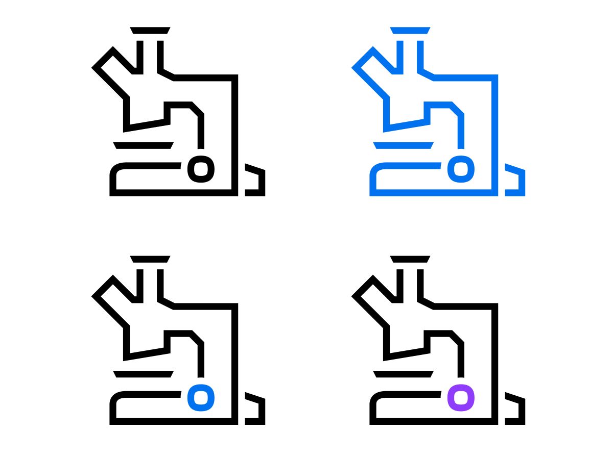
The expressive icons are designed to be used in two colors, while still functioning effectively in single-color applications.
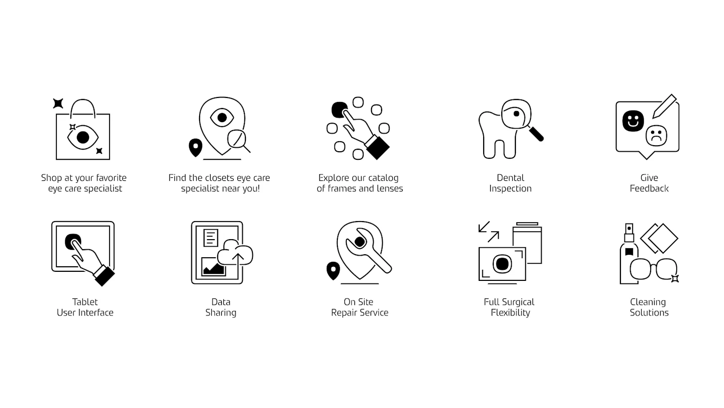
The story icons combine shapes, symbols, and diagrams to tell stories and explain systems and ideas.
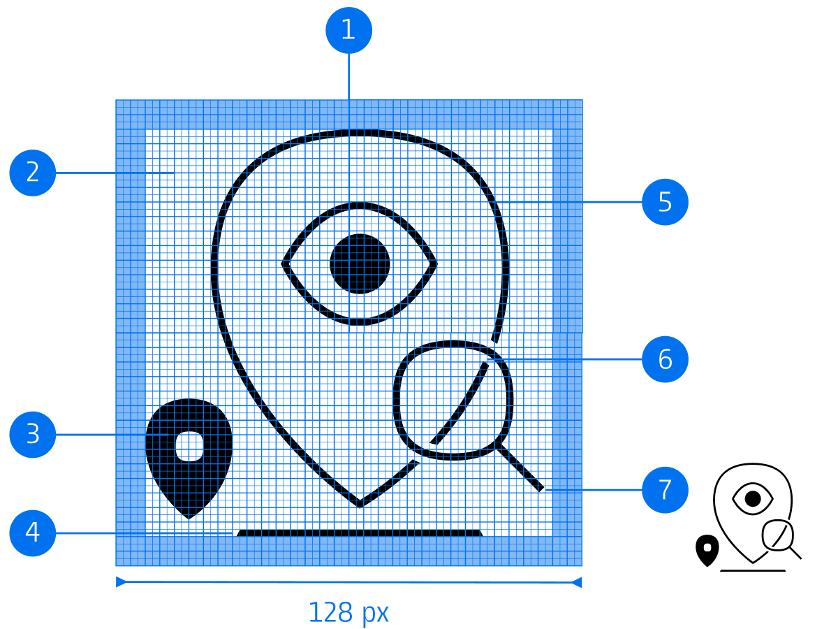
Canvas (128 x 128 px)
Live area (112 x 112 px)
Non-orthogonal curve
Slant
Thickness (2 px)
Counter space (2 px)
Stroke ending (sharp)
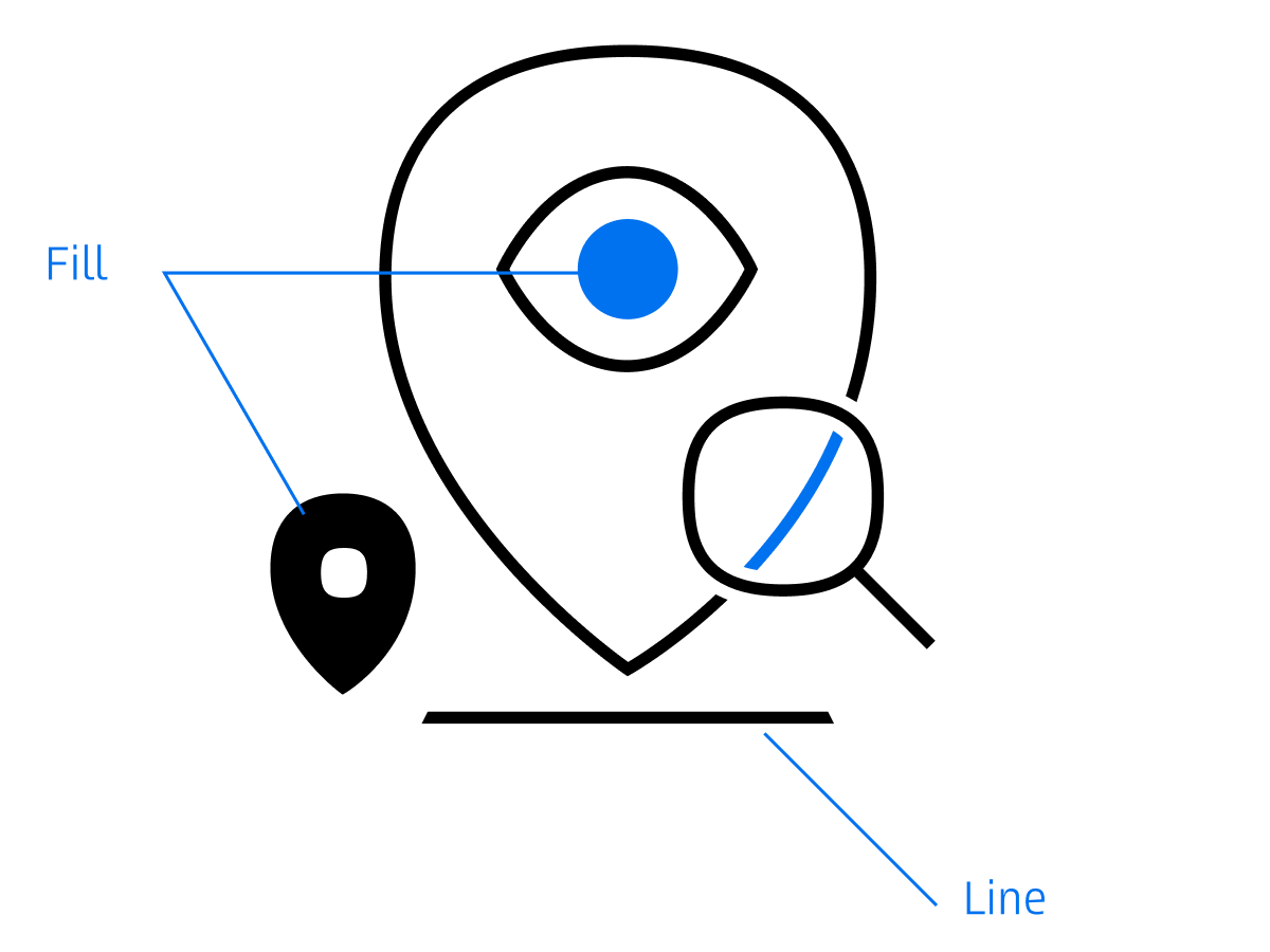
Story icons combine linear drawing and areas of color, making them more like illustrations.
These filled areas create emphasis and contrast, guiding the viewer’s attention and enhancing storytelling.
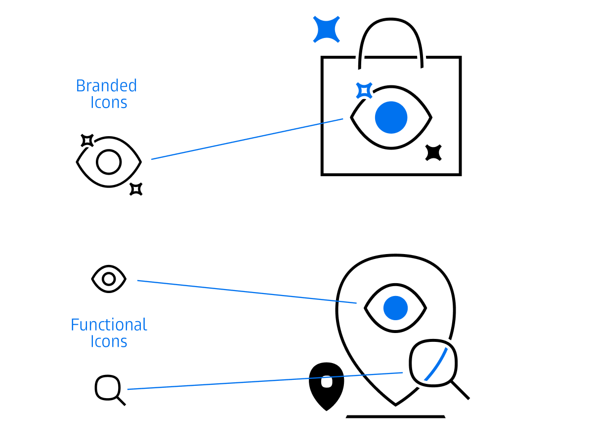
Story icons can be combined with functional and expressive icons to create richer compositions. This combination ensures consistency and connects story icons to the rest of the iconography system.
Corporate Brand, Communications & Public Affairs