ZEISS Typeface is our exclusive font family developed specifically for ZEISS. It is used across different touchpoints – digital and analog, internal and external.
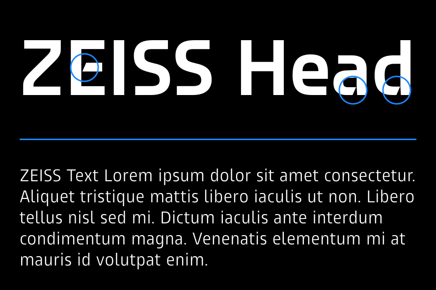
ZEISS Typeface consists of ZEISS Head for headlines and ZEISS Text for other applications.
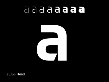
ZEISS Head is intended exclusively for bold, eye-catching messages and is available for download on the Brand Portal.
ZEISS Head is also available as a variable font for use in motion design. Professionals can use it to create smooth font weight transitions in professional tools such as Adobe After Effects. Learn more in the video & motion section.
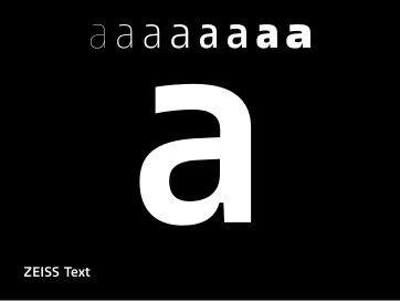
ZEISS Text is the font for other digital and analog communication at ZEISS. On its own and in combination with ZEISS Head, it is key to a coherent and distinctive brand appearance across different communication channels and touchpoints. ZEISS Text is preinstalled on every ZEISS computer.
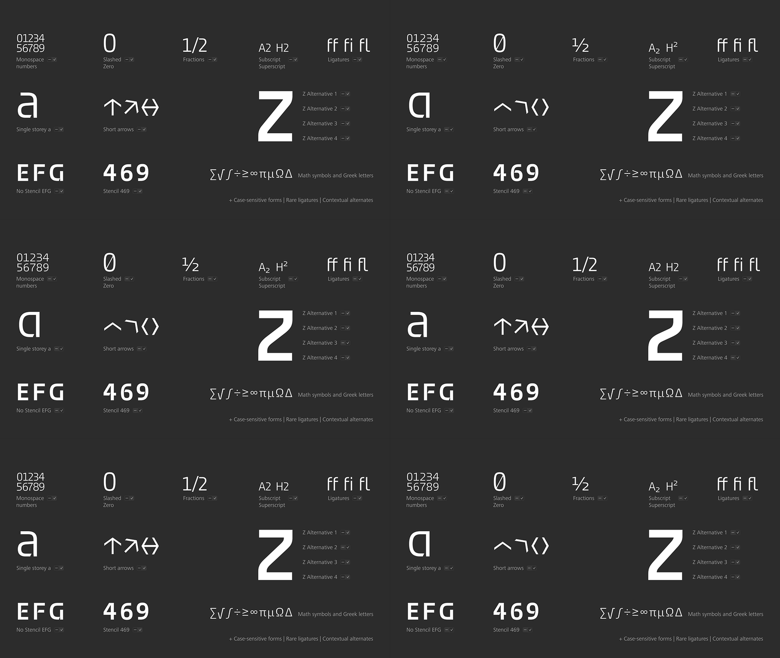
In addition to the complete Latin alphabet, ZEISS Typeface includes the full Cyrillic glyph set, including Kazakh, as well as Greek.
ZEISS Typeface also contains all standard symbols used in technical documentation.
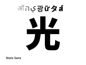
Noto Sans can be used across language regions not covered by ZEISS Text. Noto Sans is designed to support a wide range of scripts and characters, making it an ideal choice for multilingual applications.
The properties of Noto Sans are similar to those of ZEISS Typeface.
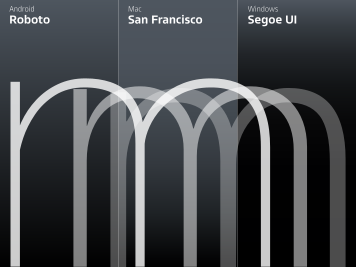
System fonts in Windows and Apple operating systems, such as Segoe UI and San Francisco, are designed for optimal readability and functionality across devices. These system fonts are recommended for user interfaces and apps, as they ensure consistency and compatibility with the operating system's design standards.
For your email signature, the font Arial is used to ensure readability.
Below you will find general recommendations for working with ZEISS Typeface.
The layout section provides detailed examples and templates.
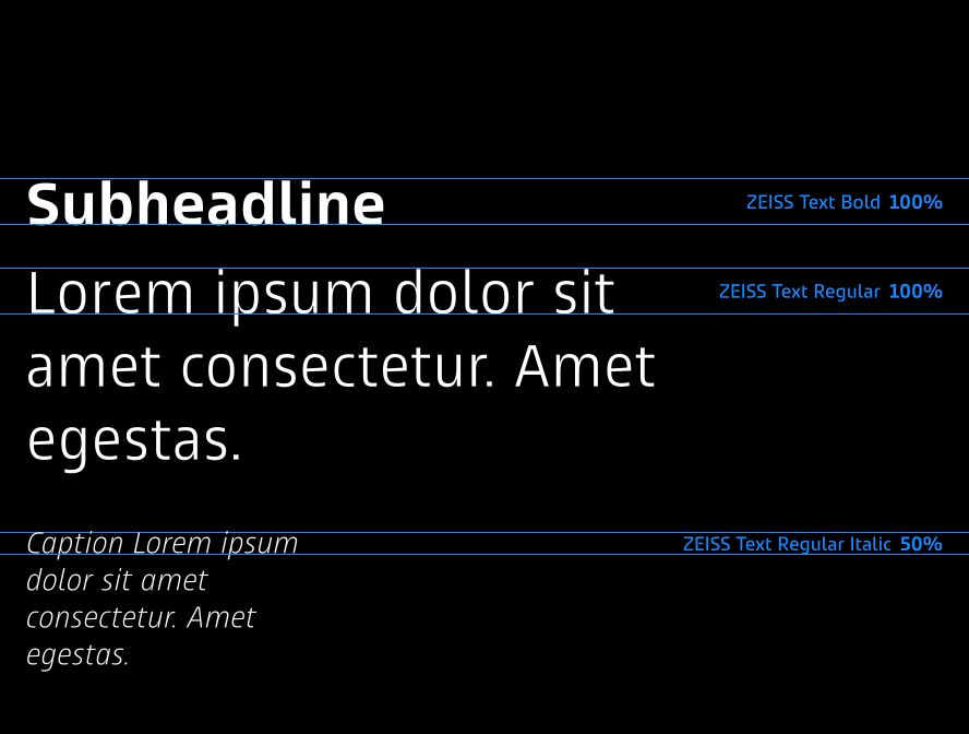
Use short lines and well-structured texts with a clear hierarchy to enhance readability.
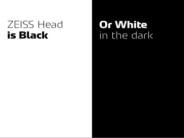
Use black text on a white background or white text on a black background.
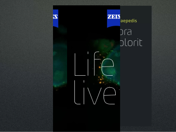
Opt for short, concise headlines. These attract attention and are easier to remember.
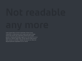
Poor readability and accessibility
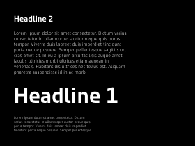
No clear font hierarchy
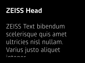
Headline too similar in size to body text
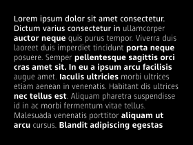
Excessive use of mark-ups
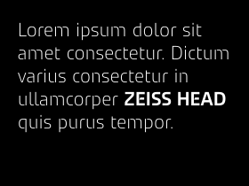
ZEISS Head used inside body text
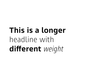
Too many different font weights in a headline
Corporate Brand, Communications & Public Affairs