A layout is the spatial arrangement of elements in digital and analog applications.
Elements are arranged in the layout to create depth. The most important element in the layout is always closest to the viewer and therefore appears the largest. This gives each layout a clear hierarchical structure and a distinctive visual signature.
In the following examples, the geometric shapes represent individual elements in the layout, such as an image, headline, or logo.
The hierarchy of the individual elements is flexible. Take advantage of this flexibility to create layouts that support your communication goal along the customer journey.
When developing your layout, think about your audience: What is the most important message you want to communicate? What is most relevant for your audience?
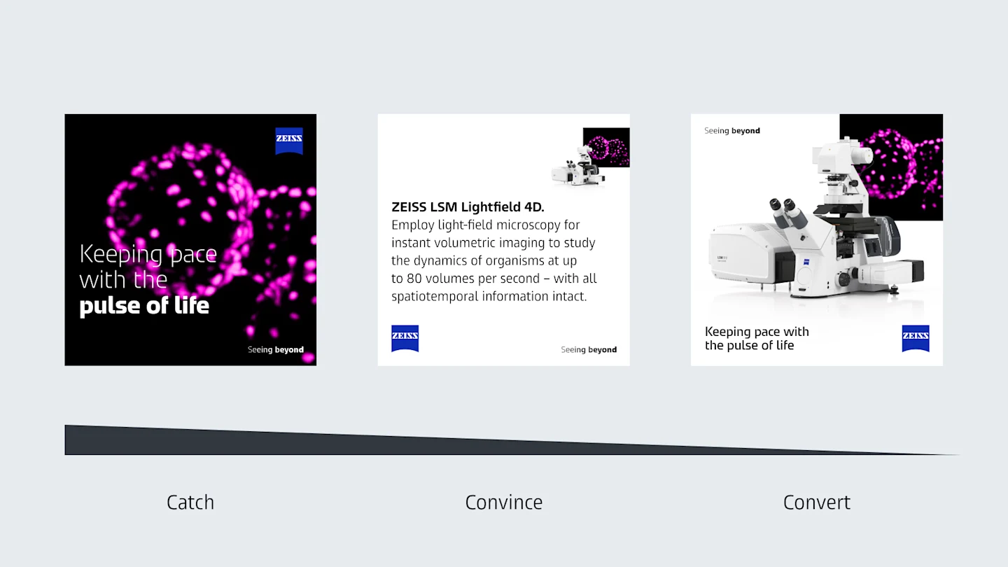
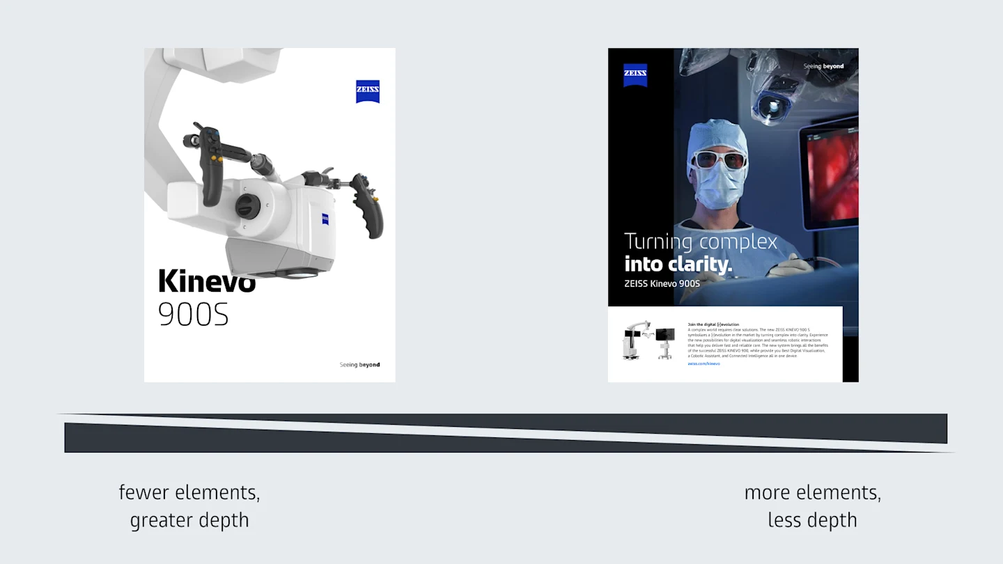
The use of spatial effects such as overlaps or bleeds varies depending on the number of elements.
The spatial arrangement is not a stylistic preference – it expresses the Brand Essence, Seeing beyond. The most important element appears closest to the viewer and is therefore largest. This creates hierarchy, depth, and a distinctive visual signature. Flat layouts without contrast in size or depth should be avoided, as they dilute the brand’s core idea and reduce clarity.
Start with communication intent. How do you want to catch the audience, what should convince them, and what should convert them? The most important message for that specific stage of the journey should be visually dominant. The system is flexible – hierarchy supports strategy, not the other way around.
Spatially arranged elements should preferably not be aligned directly along the edges, as this reduces the sense of depth. The layout should feel layered and dimensional. Exceptions apply for small formats with specific safe zones, such as certain social media formats, where alignment may be required for functional reasons.
Simple layout: This is used when only a few elements are needed, such as a headline and an image. Each element stands independently in space.
Advanced layout: Image and possibly a headline are arranged spatially; logo, tagline, and copy sit in a front layer aligned with the margins.
Complex layout: When many elements are required, additional content is grouped in a rectangular container layer arranged in space.
Choose the layout based on content density – never force complexity if simplicity communicates better.
Yes. The dynamic tagline must not be combined directly with the logo. In this layout design, the logo and tagline are separate elements placed in opposite corners, with a minimum distance of two logo widths between them. The tagline should not be used as a headline.
Not necessarily. In closed brand contexts, such as on official social media channels, website, or a trade show booth, branding can be reduced. In some cases, neither the logo nor tagline is required. The system allows flexibility, but only when the audience is clearly aware that they are in a ZEISS environment.
ZEISS Head and ZEISS Text are variable fonts, offering flexibility in weight and width. However, legibility and functional clarity always come first.
Key guidelines:
Prioritize strong contrast between text styles.
Avoid mixing more than two weights or more than one width within a single text element.
Replace ZEISS Head with ZEISS Text for long, body-like texts, especially in small formats.
Expressiveness is welcome, but not at the expense of clarity.
The overall brand stage colors remain black and white. Secondary colors are used selectively and purposefully. ZEISS Azure is reserved for functional elements such as call-to-action buttons. Headlines, taglines, and body text must not be colorized. The canvas/background itself must also never be colorized. Restraint ensures brand consistency and perception as a premium brand.
Corporate Brand, Communications & Public Affairs