Elements are arranged in the layout to create depth. There are several techniques to achieve this effect.
Every layout starts with an empty canvas. The background can be white or black, or it can be an image or video.
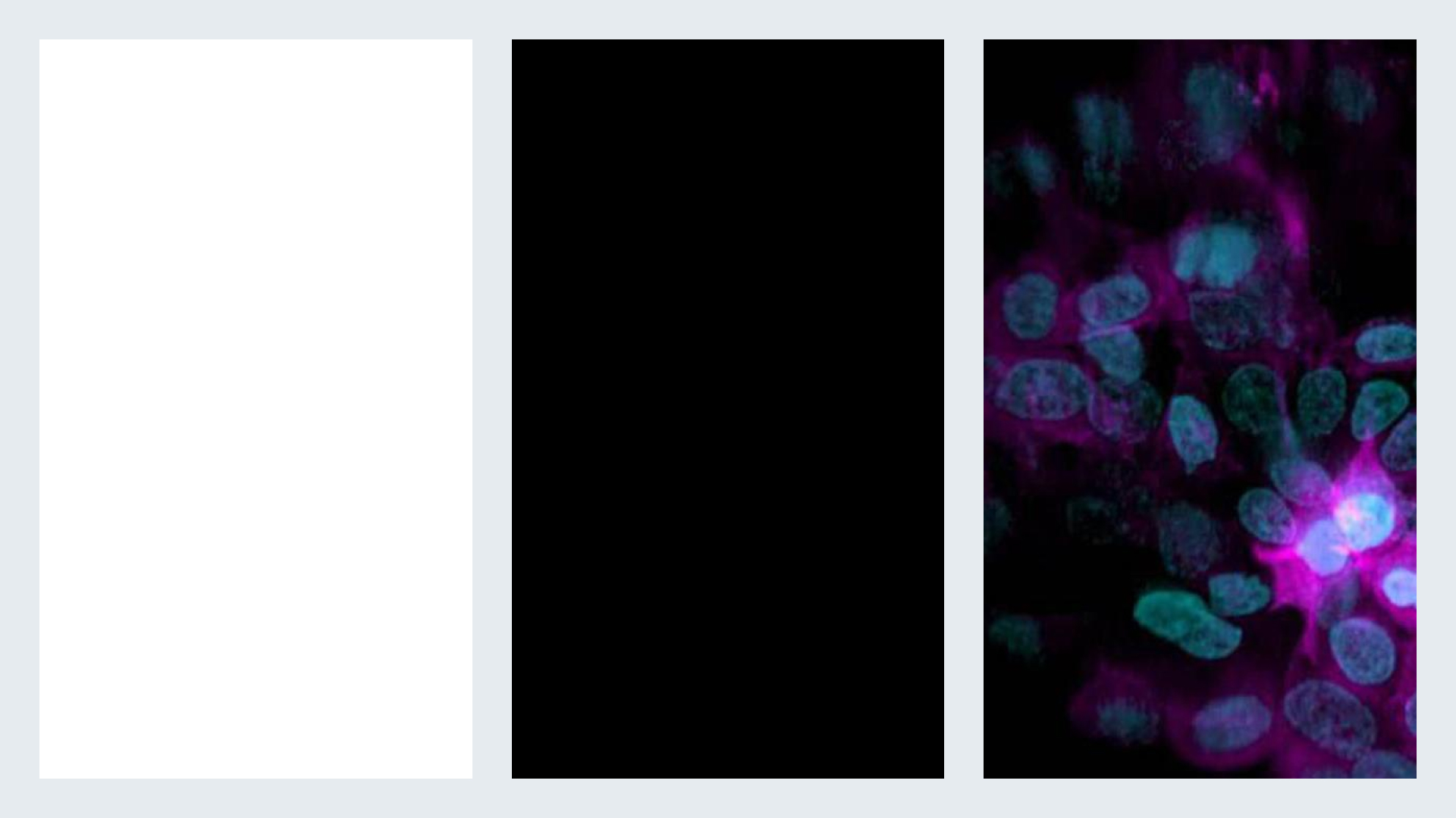
In the following example, the geometric shapes represent individual elements in the layout, such as an image, headline, or logo.
Use content-free areas to create depth.
Arrange different-sized elements to create depth.
Place elements along a diagonal to create perspective.
Use overlapping elements that go beyond the edge of the layout to create a sense of near and far.
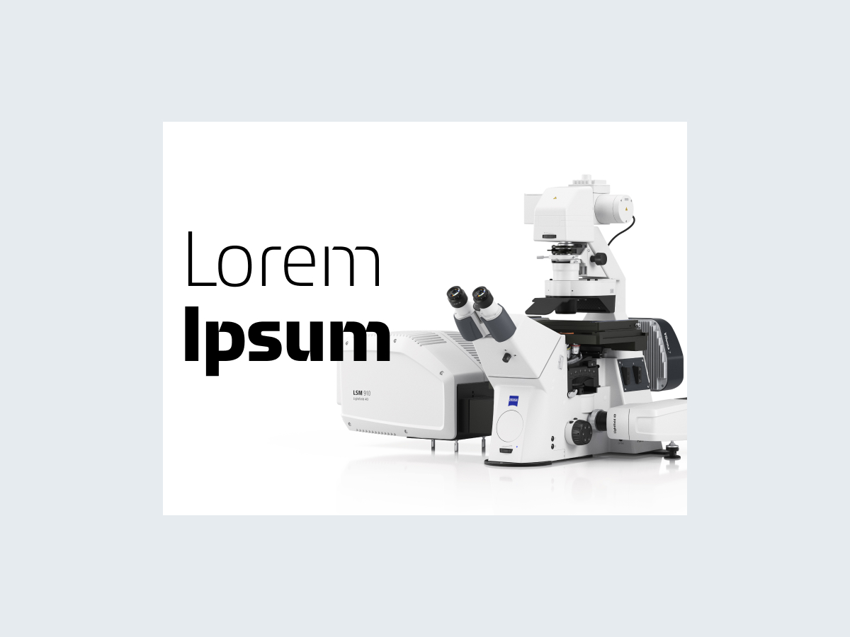
A short headline in front of a product packshot
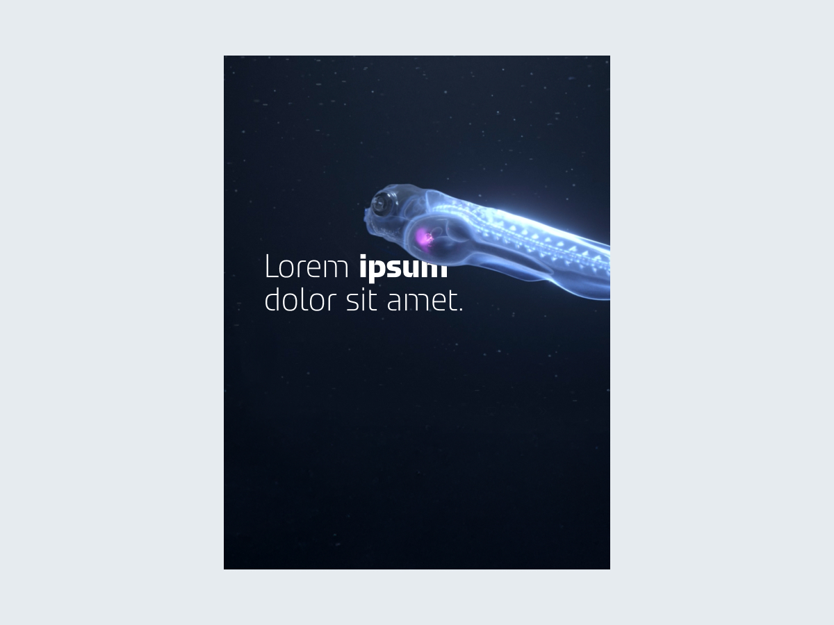
A headline partly overlapped by an image element
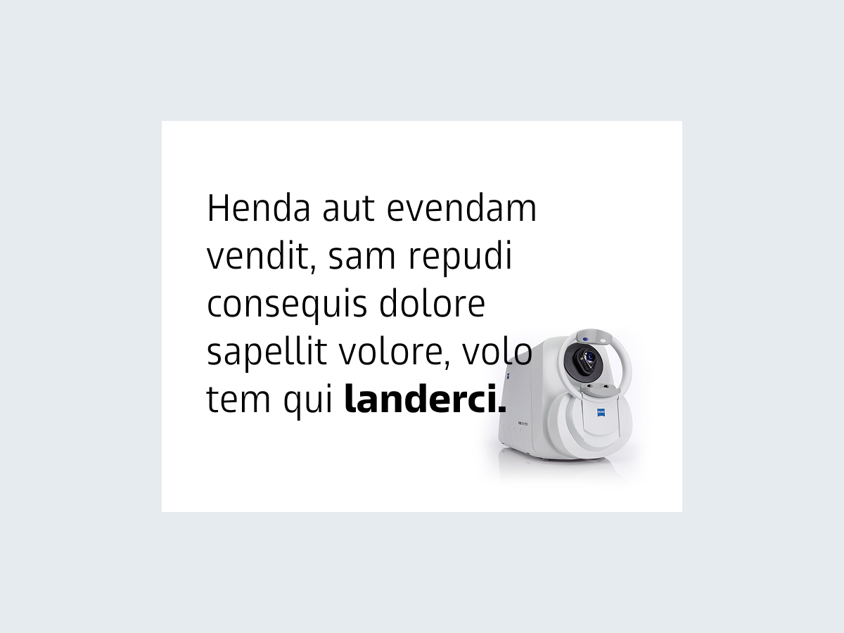
Longer text written in ZEISS Text and placed in front of a packshot
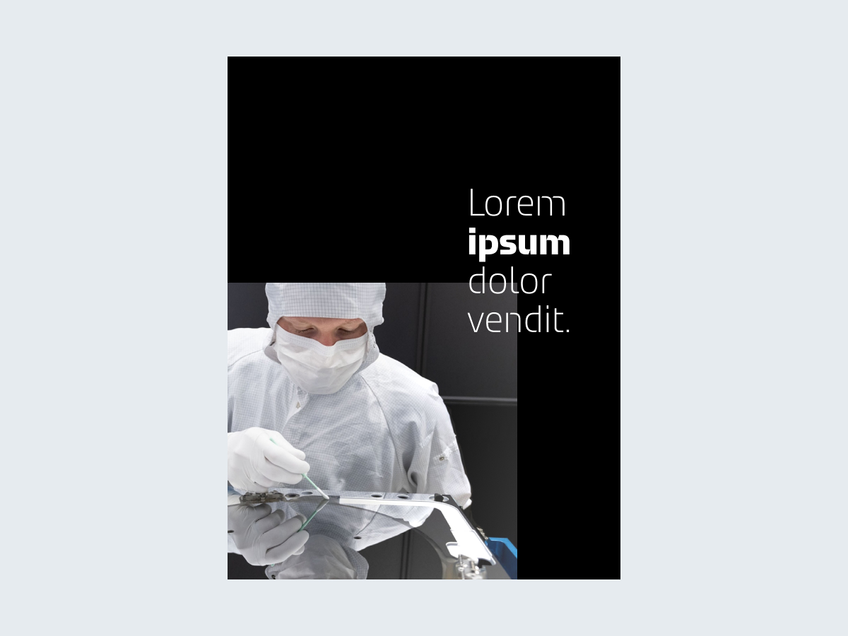
A rectangular image that extends beyond the edge of the layout on two sides, partly overlapped by a headline in the foreground
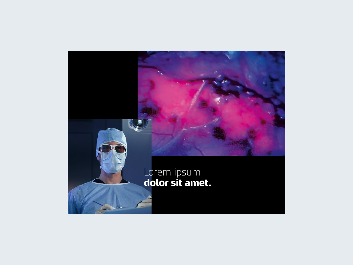
Two overlapping rectangular images that extend beyond the edge of the layout on two sides, with an overlapping headline in the foreground.
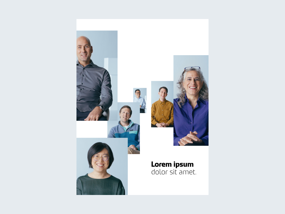
Several rectangular images in a staggered arrangement, with a headline placed in between the images without any overlap
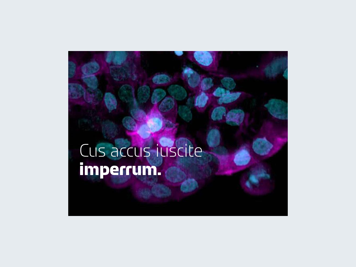
A full-bleed image in the background with a headline in the foreground.
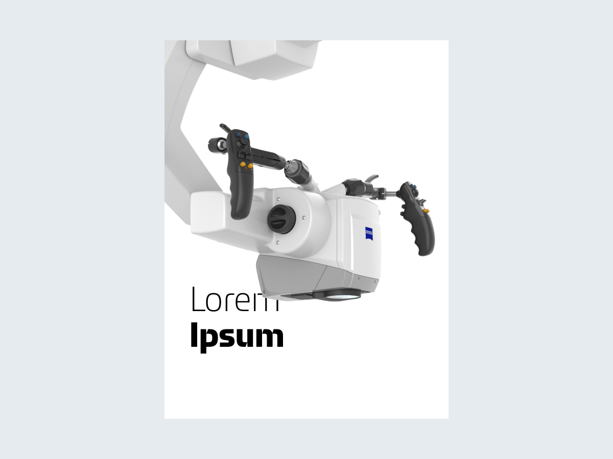
A large product packshot that extends beyond the edge of the layout and slightly overlaps the headline
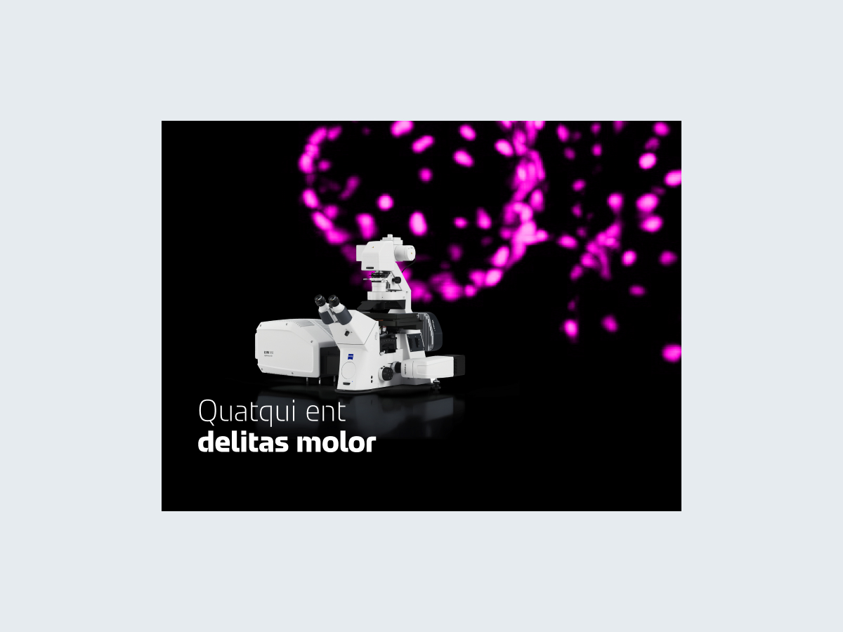
A packshot in front of a background image, with the headline in the foreground
Margins for print and digital media are defined in all available templates.
These templates are also intended for new formats that differ only slightly from an existing one.
Application-specific features, such as printing specifications or safe areas on screens, must always be observed.
Longer text should not be placed at the edges of the layout.
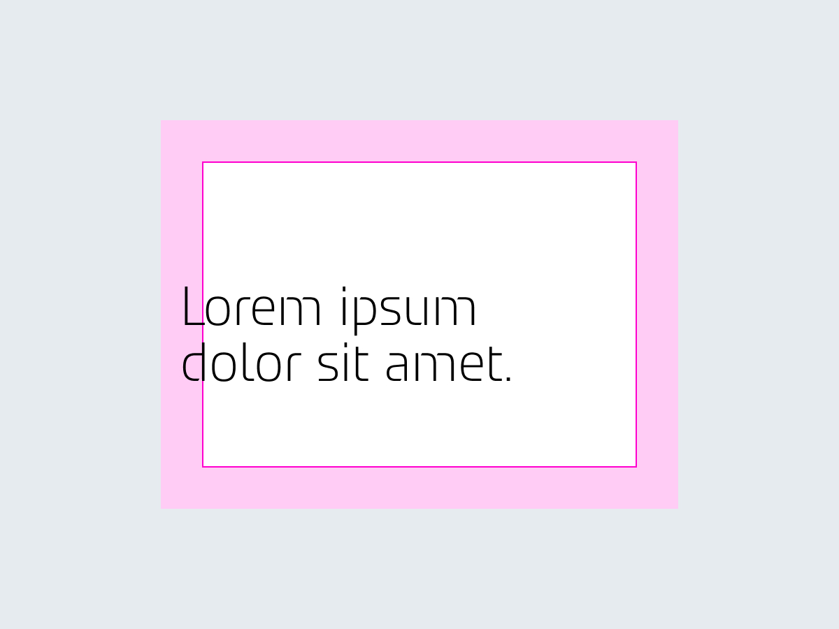
Large headlines may be placed in the margins.
Ensure that the text is not cropped for print products.
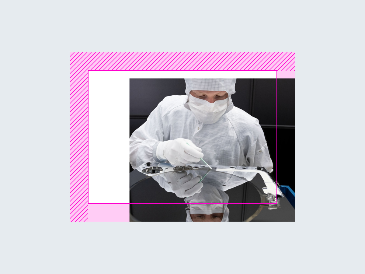
Rectangular elements, such as images, can extend into the bleed on one or two sides.
Keep the other sides of the image within the format’s margins.
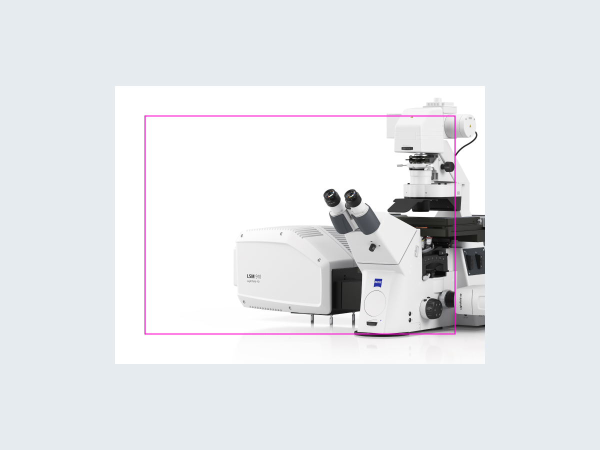
The position and size of the product packshot in product presentations are flexible.
Make sure all the key parts are visible if you crop the product packshot.
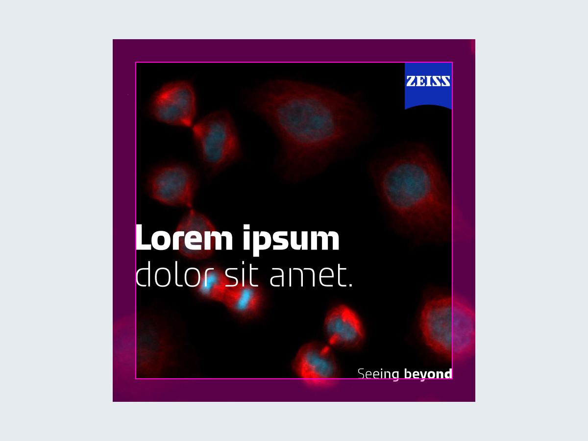
In small formats with specific safe zones, such as in social media, headlines may be aligned with the margins.
To avoid random and crowded layouts, you need to group elements in certain ways to create depth. There are three possible layouts: simple, advanced, and complex.
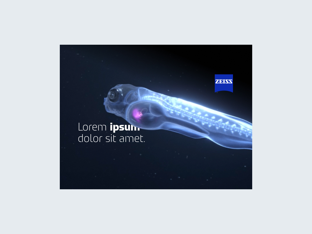
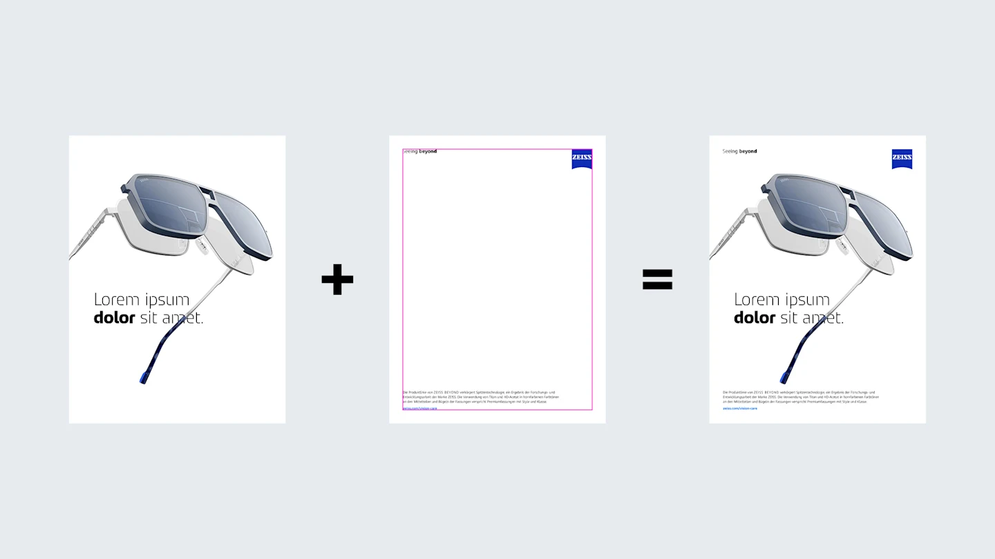
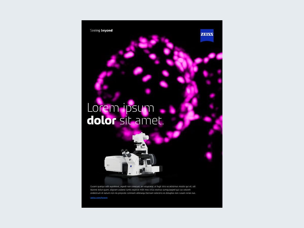
This layout is used when there are only a few elements, such as a headline and an image, or a headline, image, and the logo.
Every single element is arranged separately in the layout.
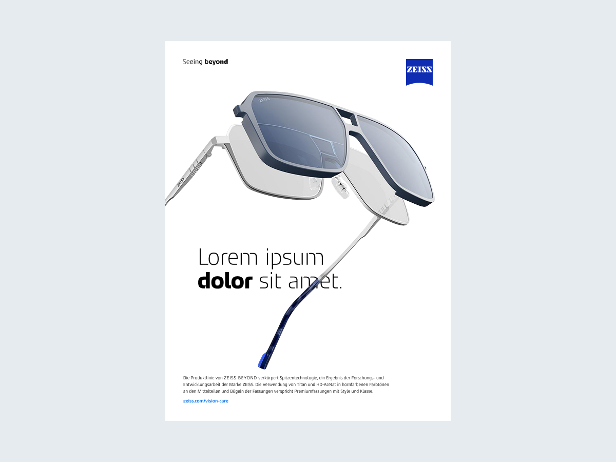
The image elements and the headline are arranged on two levels.
The logo, dynamic tagline, and other elements like body text are arranged in front and aligned with the margins.
The image elements are placed behind the text.
Tips:
Use black font on white backgrounds or bright images.
Use white font on black backgrounds or dark images.
Make sure that the headline, body text, and tagline are always easy to read.
Simplify the background and increase the contrast, such as with soft shadow or highlight spots, if the text is hard to read.
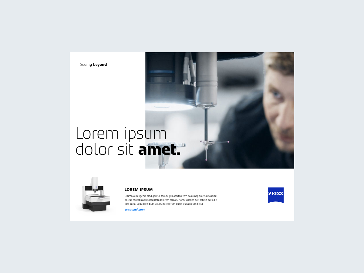
Use a box if the text is illegible – see description below.
Observe the techniques for creating depth to determine the right positions and sizes of spatial elements
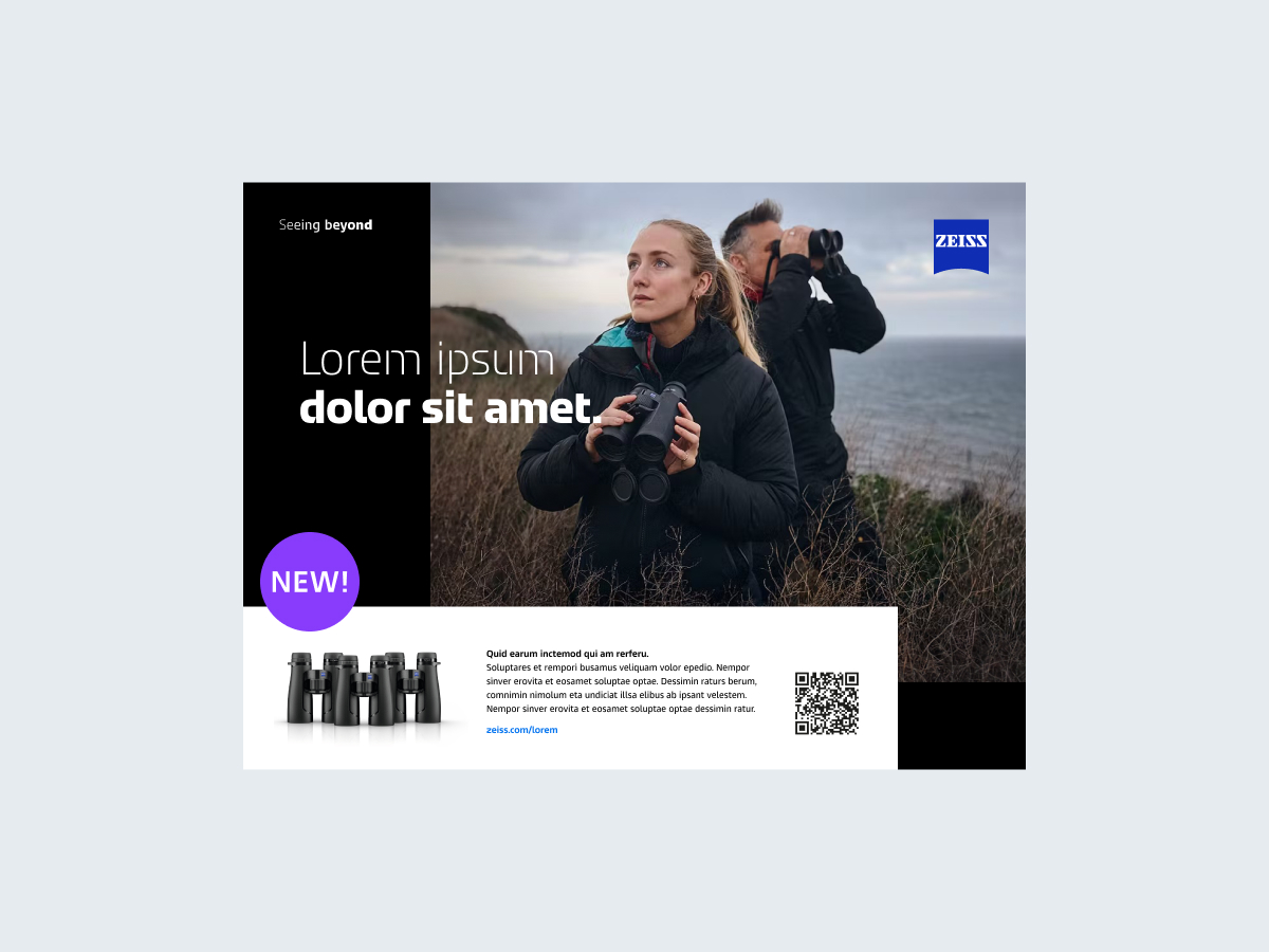
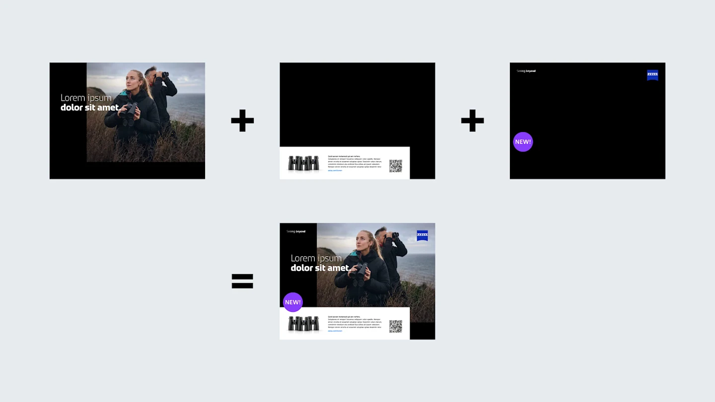
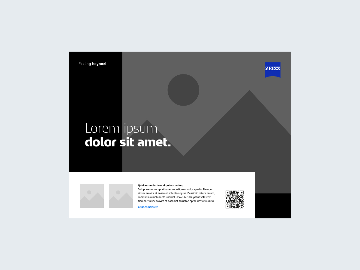
This layout is used when there are too many textual and visual elements for the standard layout.
The headline and image elements are arranged in layers.
The logo and dynamic tagline are arranged in front and aligned with the margins.
Additional elements are grouped in a rectangular box.
Tips:
The box is always white and opaque and is placed on black backgrounds or background images.
For white backgrounds, no box is necessary – the elements are placed directly on the background.
The content of the box is flexible: It can include text, product images, QR codes, a call to action, or graphic elements.
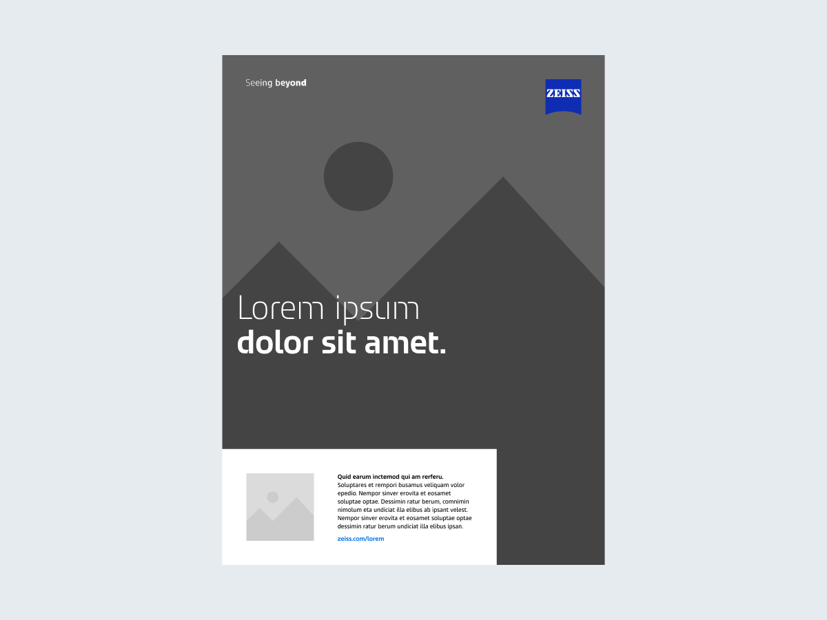
The box is always placed at the bottom of the layout.
The box should be flush against two sides of the layout. In extreme formats, the box might be flush against three sides.
The box should never take up more than one-third of the space.

Flat-looking layouts without contrasts in size

Every single element with its own layer in complex layouts

Illegible text

Oversized box

Box on a white background with drop shadows

Non-white box
Whenever possible, motion should be part of the asset. There are three options for creating spatial motion in layouts.
A product clip uses spatial animation.
A camera movement ends in a static layout.
The layout changes in a loop, showcasing the different layout options. This option is used whenever the content continuously loops.
3D motion setups should always be your first choice when producing assets, such as by using 3D layers in Adobe After Effects, combined with a moving camera instead of a 2D setup.
Corporate Brand, Communications & Public Affairs