Below you will find details about our Brand Design Elements for layouts. Learn more in these sections:
Logo and tagline
Typography
Imagery
Colors
Below you will find several branding options, as well as possible combinations for the logo and tagline, Seeing beyond.
This is the standard branding option for communication.
The logo is aligned with the margin and placed in a corner.
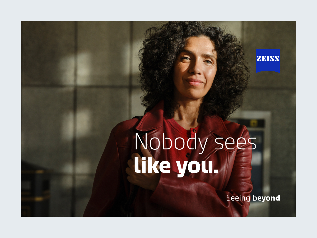
Branding with the dynamic tagline and logo always takes place in conjunction with the other layout elements.
The aim is to create a harmonious composition overall.
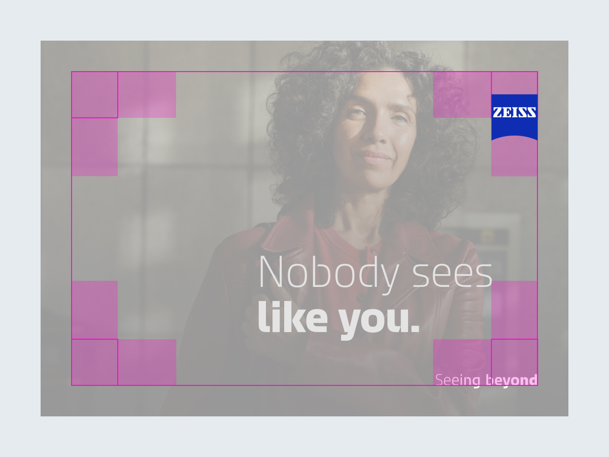
The logo is aligned with the margin in the extended corner area.
In spacious layouts with only a few elements, the logo should not be placed in the corner to enhance the spatial experience.
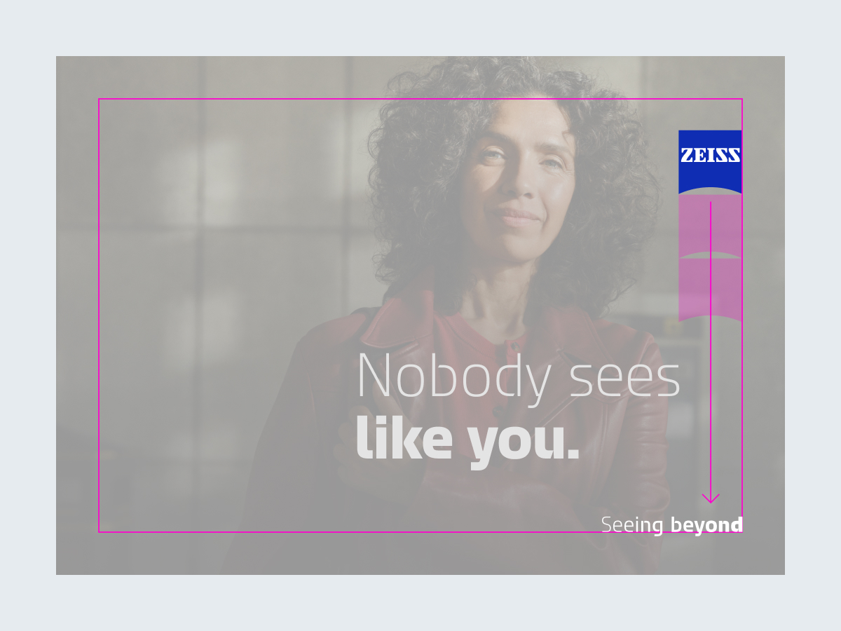
The dynamic tagline is placed in a corner opposite the logo.
The distance to the logo should always be at least twice the width of the logo.
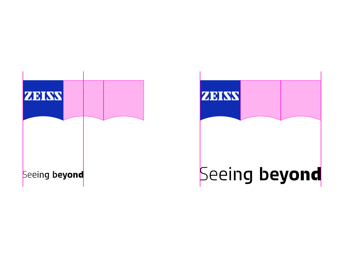
For maximum flexibility, there is no fixed logo-to-tagline ratio.
The tagline should be between 1.5 and 3 times larger than the logo.
The logo and dynamic tagline must always be legible.
When different media are used at a single touchpoint, such as at a trade fair or point of sale (POS), ensure that the sizes, proportions, and positions of the logo, tagline, and text are synchronized.

Dynamic tagline placed directly under the logo

Dynamic tagline used as a headline

Logo covered by other elements
The logo may appear without a tagline in small formats with limited space, such as in social media posts and ads.
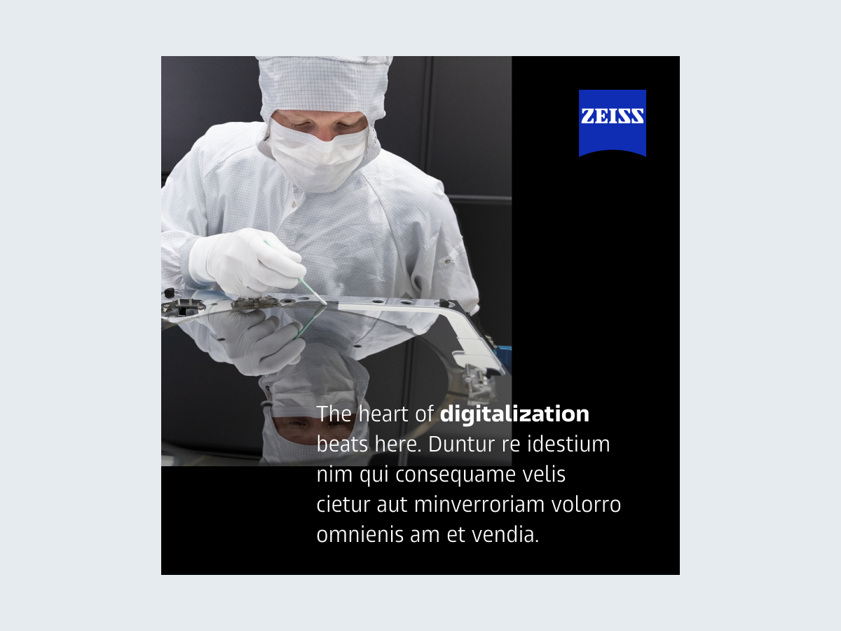
The logo can be flush against the format’s margins.

The logo can also be placed freely in the format when it enhances depth.
This option is reserved for simple layouts with few elements.
The dynamic tagline can be used without the logo when the context is clear and the customer is aware of being in a ZEISS environment. This includes the ZEISS website, social media channels, or a trade show booth.
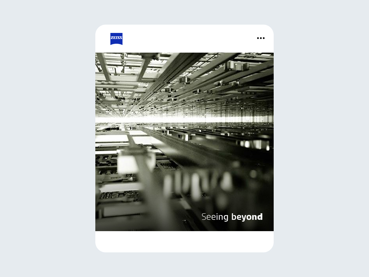
The dynamic tagline should not be treated like a headline but placed in a corner.
The dynamic tagline may be used as an add-on for visuals.
The logo and tagline can be left out in clear, branded contexts when the customer is aware of being in a ZEISS environment. This includes the ZEISS website, ZEISS social media channels, or a ZEISS trade show booth.
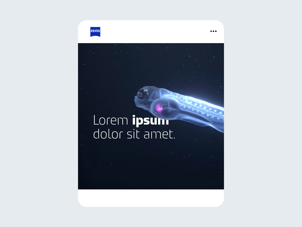
Standard social media posts or stories do not necessarily require any branding because the ZEISS channel is branded.
The combination of logo and tagline is only used as a PowerPoint closing slide and in the logo ending in videos. The dynamic tagline must not be used directly below the logo. Always use the official file, which is available for download.
Standard video outro, available for download
ZEISS Head and ZEISS Text are the fonts we use for headlines and body text, respectively.
Text should always be legible and easy to read, especially for longer texts.
ZEISS Head and ZEISS Text use a default letter spacing of 0. Uppercase scenarios, such as overlines, are spaced with 40/1,000 EM units in Adobe programs or 4% in Figma.
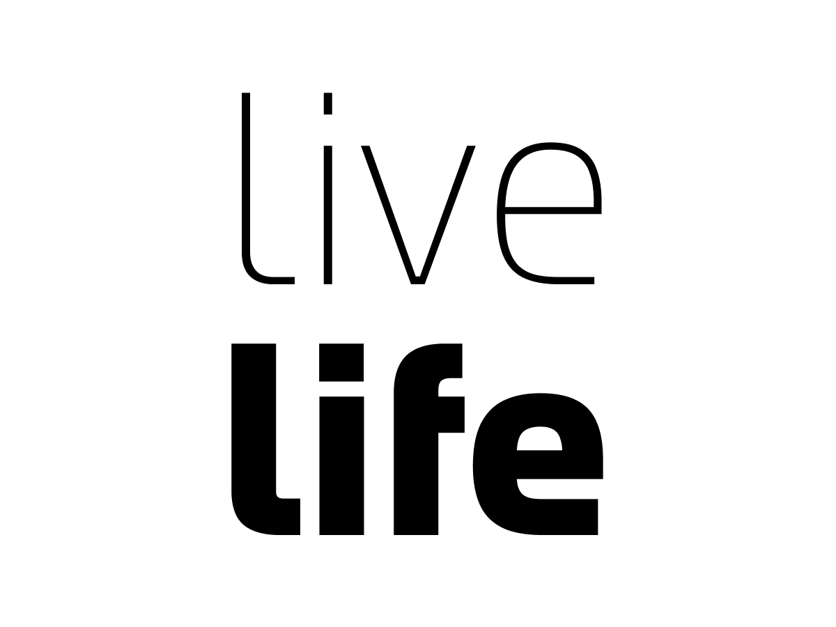
Whenever appropriate, play with extreme contrasts in static as well as motion applications.
Ensure multiline headlines always have a low line height.
Use 100% line height for mixed case letters with ascenders, descenders, and accents on lowercase letters.
Use 95% line height for uppercase letters or mixed case without descenders and accents.
Use 110%– 115% line height in those very rare scenarios when an uppercase letter with an accent stands directly under a descender
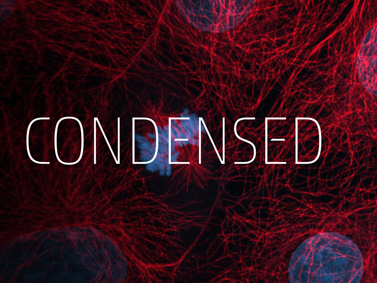
For most applications, the standard letter width is preferred.
When it supports the message or helps to maximize the text size, the styles Narrow and Condensed may be used.
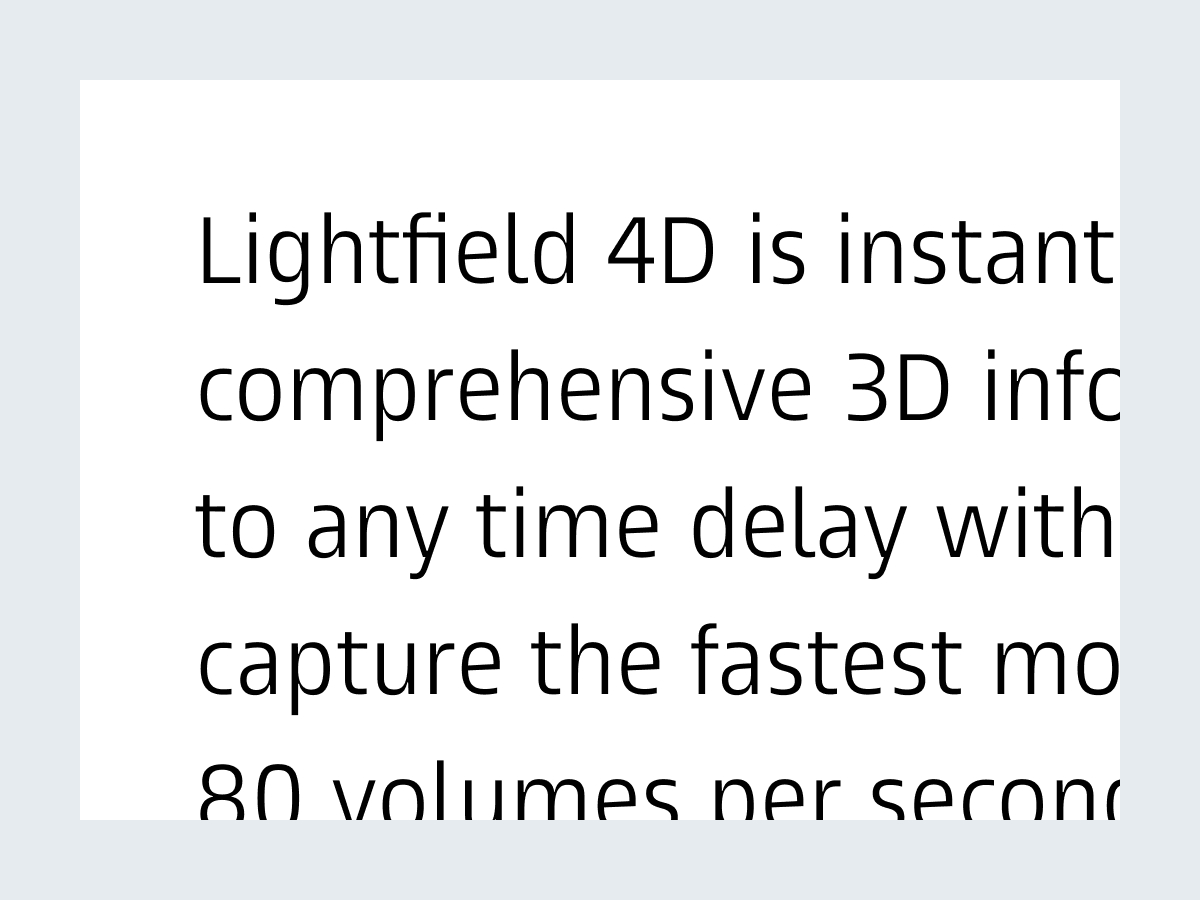
Choose from a variety of styles to present information.
Use large line heights for improved readability.
The regular letter width is preferred. For larger amounts of text, Condensed can be used.
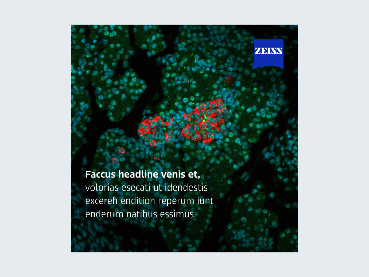
When the headline reads more like body text, use ZEISS Text for small formats, such as social media posts.
Also use larger line spacing of at least 130%.
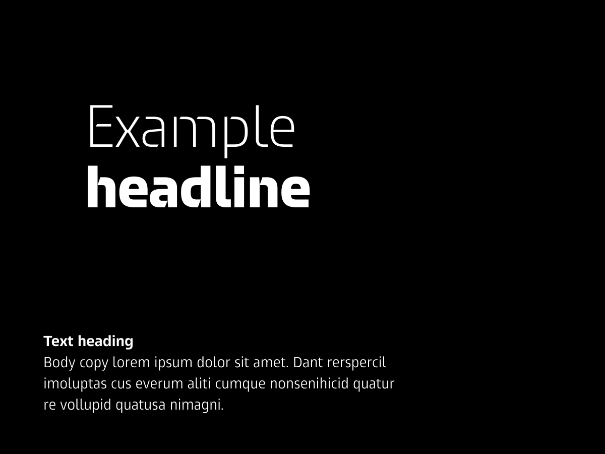
Use as few text components as possible.
The ideal combination includes a headline paired with body text and its own heading.
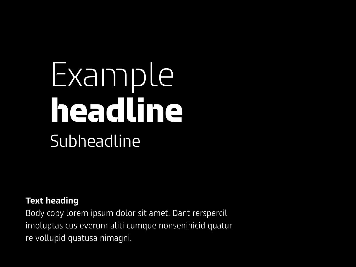
In cases where a subline is needed, it should be at least one-third smaller than the headline, ideally half the size.
There should also be a clear visual contrast between the headline and subline:
A light/black headline can be paired with a subline in medium style.
A medium headline might be paired with a light subline.
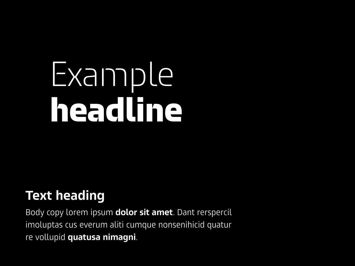
The text in the heading can be increased in size to draw attention to the body text.
The text in the heading should be at least one-third larger than the body text.
The text in the heading should also be significantly smaller than the headline.
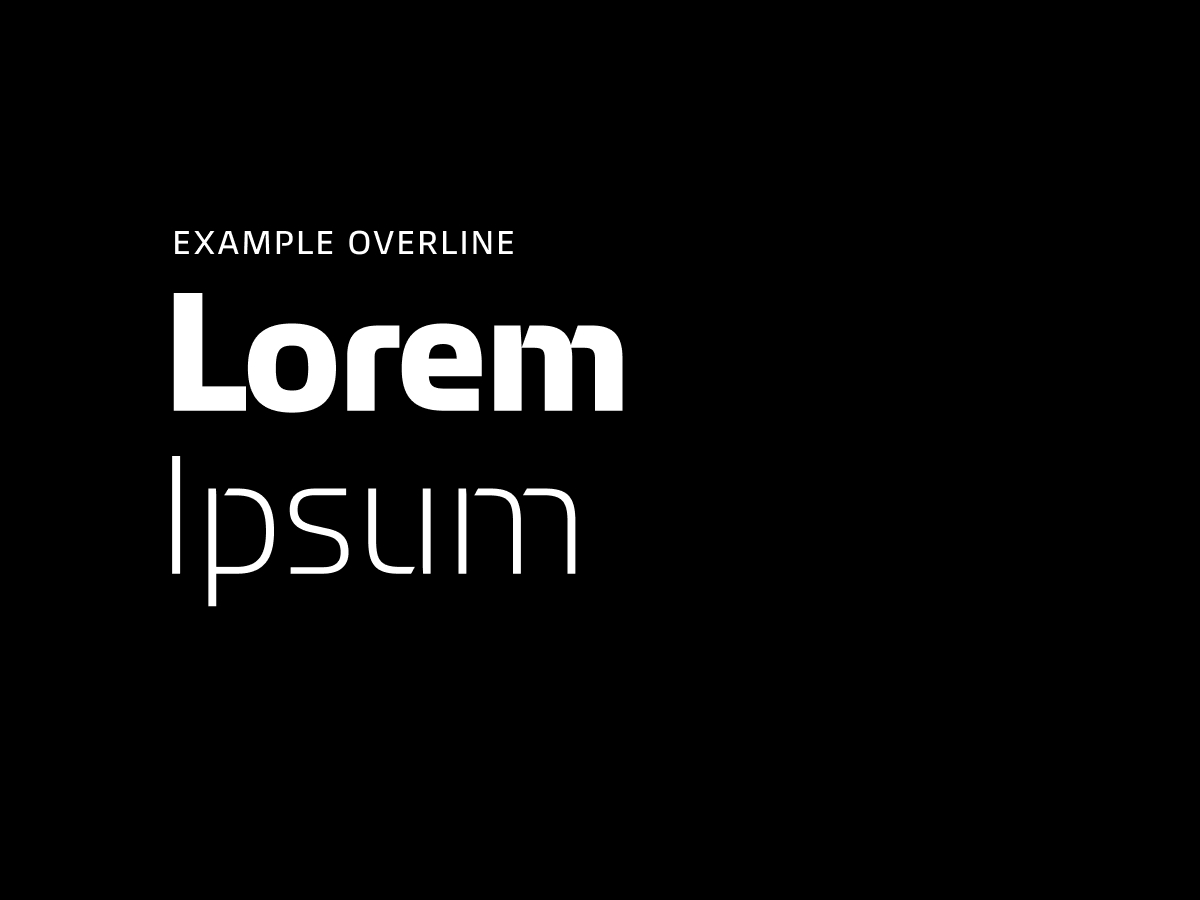
Small uppercase overlines can be used in layouts with less text and large headlines. They should not exceed one-fourth the size of the headline.
Overlines should not be combined with subheadings.

Low-contrast text combinations, such as Regular and Medium

More than two weights or widths in a single text element

More than four different text sizes in a single layout
There are several ways to use images in the layout.
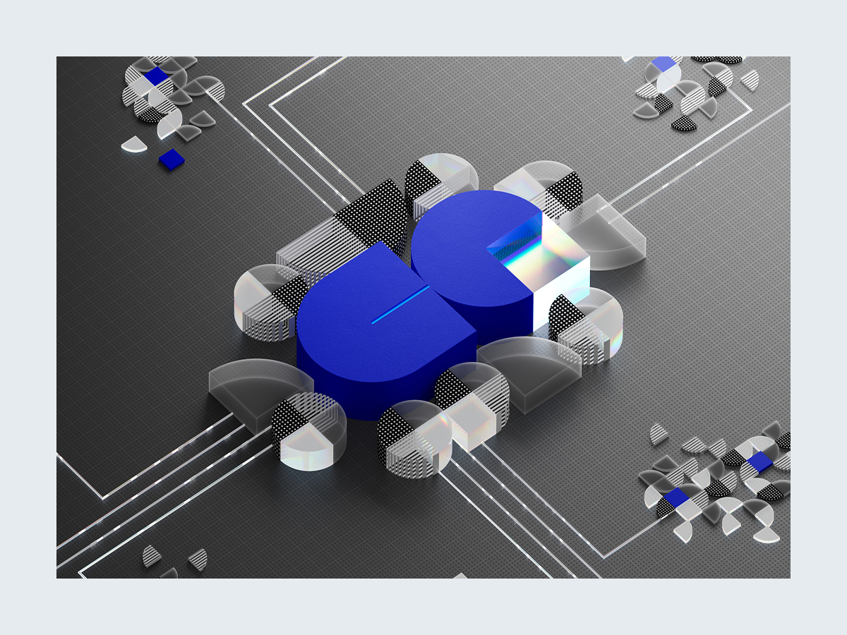
The entire canvas is filled with a single image.

One or more rectangular images are placed on the canvas in the bleed.
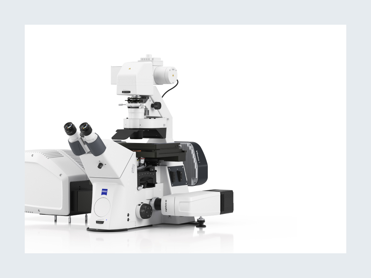
Product packshots are placed on the canvas as cutouts.
The primary colors of the ZEISS Brand are black and white.
The targeted, selective use of secondary colors can draw attention to individual elements and thus provide additional information.
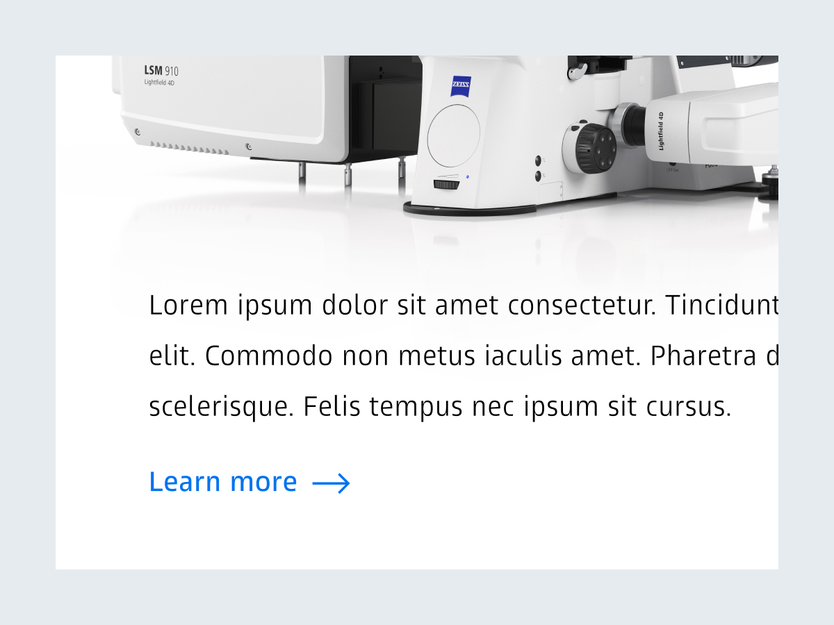
Only ZEISS Azure is used for interactive elements, such as links or buttons.
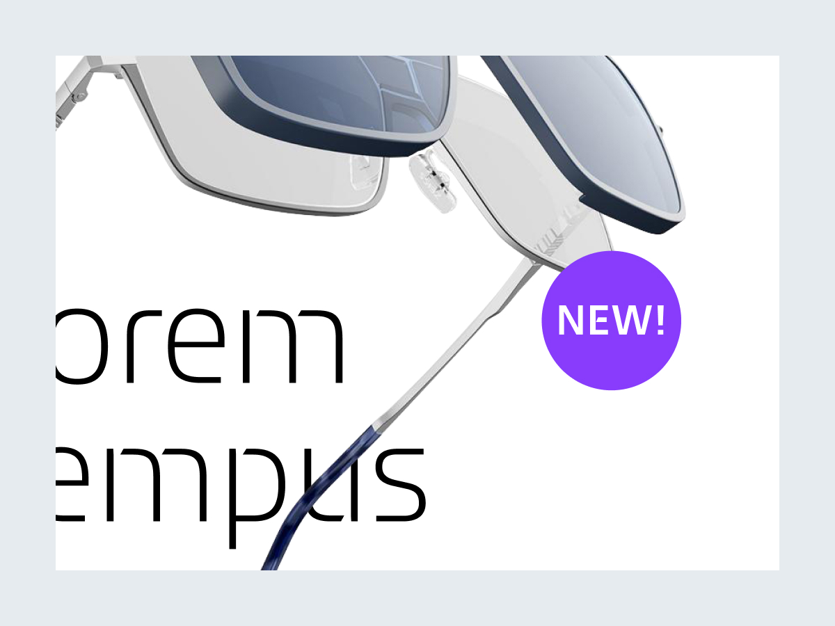
You can highlight new products or special offers with colored circular shapes in ZEISS Violet or ZEISS Lime.

Colorizing the canvas or background

Colorizing the headline, the dynamic tagline, or body text

Colors other than ZEISS Azure for interactive elements
Corporate Brand, Communications & Public Affairs